

Branding, Digital
Introducing Adaptive Reuse for Experience Design & Development
Does the word “redesign” terrify you? How about “adaptive reuse”? You don’t always need the all-in investment of a total redesign and rebuild. Blake Scott explains “adaptive reuse” in the context of digital experiences, and how we used an adaptive reuse strategy to reinvent our very own site, portent.com.

April 12, 2016
This article was originally published over on The Portent Blog.
The Concept of Adaptive Reuse
Does the word redesign terrify you? I know it does to many. After all, there are so many risks associated with tackling a redesign, so many ways to screw up your online presence, so many stakeholders to piss off.
Luckily, you don’t always have to redesign. Before you scrap everything, explore an Adaptive Reuse approach. It’s an incremental design process in which you work with what already exists, both functionally and aesthetically, iteratively transforming the experience. In fact, we recently completed an adaptive reuse project on our very own site, portent.com. The experience is greatly improved, and without the all-in investment of a total redesign and rebuild.
Here’s a more detailed explanation of Adaptive Reuse:
Adaptive Reuse is a strategy borrowed from traditional architects, operating in the world of physical architecture. With its roots in sustainability, the strategy helps reduce costs, minimizes rework and waste, and repurposes what already exists. These benefits are achieved while striving to maintain a high-level of both customization and quality in the final product.
When we tackle an adaptive reuse project, we work with and within the existing structure of the experience (i.e. site, brand, organizational structures, office, etc.). Designed adaptations may be big and global in scope, or small and surgical in their implementation. For the right candidate, an adaptive reuse strategy can reveal numerous opportunities to bring the quality and value of an existing experience up. Why begin from a blank screen when you can facilitate the evolution of something that already exists?
To continue with the metaphor of physical architecture, additions are an important part of many adaptive reuse projects. Just as you would take care when designing and building a rooftop addition for an existing structure, it is imperative that potential additions to any digital experience be carefully considered. In the context of a website, for example, additions should not be treated as merely tack-ons or plugins – that attitude leads to the land of lost opportunity.
Instead, think in terms of the whole-system. Each addition (and/or adaptation) should strive to integrate seamlessly with the whole experience, from both perceptual and practical perspectives. In other words, successful designs will disappear. Solutions will seem obvious in retrospect.
At this point, you may be asking yourself, what does this look like in practice? Here at Portent, we aren’t shy about testing and validating our ideas within the laboratory of our own experience. Whether working on a client project, or something we’re cooking up internally, we prefer to make decisions and consequential recommendations based upon experience. What better way to test, than on yourself (famous last words). Now, if you’re so inclined, please join me for a bit of story time… let’s take a peek into our studio.

Portent.com Adaptive Reuse: Home Page – Before
Before the intervention, the home page had too many focal points and too little design.
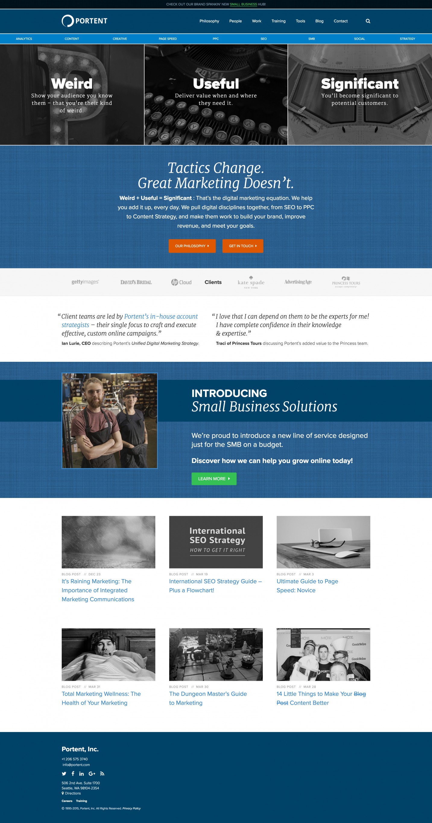
Portent.com Adaptive Reuse: Home Page – After
After: a unified, considered design, which allows the user to explore the site with ease.
The Adaptive Reuse of Portent.com
As our team set out to work on the site’s primary interface, we quickly honed in on a couple big-impact opportunities. Our goal with these focused Big Moves: to immediately and dramatically impact the site’s experience as a whole.
As it goes, we were limited on time to complete our work, as the team was preparing for a quickly approaching client project. What’s a team to do? Tackle the site-wide header, footer, and search components, of course. Our iterative design and development cycles resulted in interventions that transformed the look, feel, and interactive nature of the entire experience.
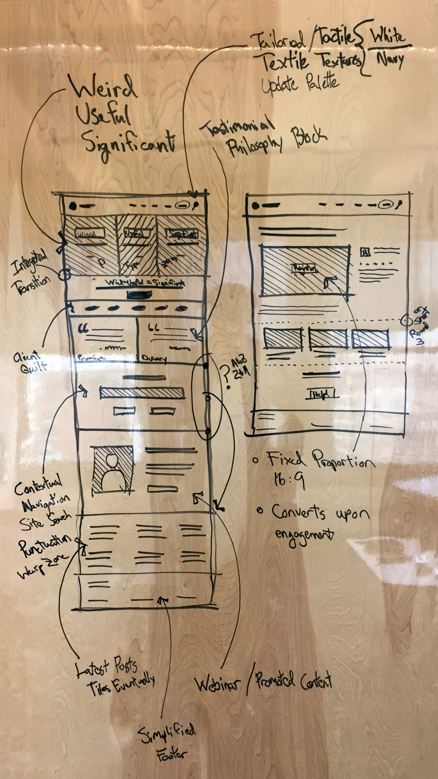
Portent.com Adaptive Reuse: Early Concept Sketch for Home Page and Training Hub
Rather than a waterfall process, we iterated between designing & developing in-browser, and sketching ideas on the dry erase board.
Early on in our process, we spent quite a bit of time discussing and sketching (i.e. stress testing) various prospective solutions: diverge, converge, critique, repeat. At no point in time did we turn to Photoshop to mock up our responsive-ready interventions.
From the whiteboard and sketchbook, we moved directly to in-browser design & development. Our project team of two proceeded, moving back-and-forth between sketch ideation and browser validation, with the final solution progressively revealing itself through each cycle. Welcome to the Integrative Design Process. (I introduced the concept of Integrative Design in a previous post.)
Framing Our Content
The most visually comprehensive updates to the experience occurred within the site’s header and footer. In their previous incarnations, the header and footer lacked adequate differentiation from the primary on-page content. Rather than acting as bookends or content-framing components, the header and footer contributed to a fragmentation in the look and feel of the Portent brand. Due to this fragmentation, it was often difficult for users to immediately recognize they were even on the Portent site. In order to address this significant shortcoming, we did a couple of things:
- Revisited the Site’s Color & Texture Palettes: We quickly honed in on a strategy that uses color and texture to frame the site’s primary content areas. These changes are both friendly and approachable, while concurrently projecting a mature and professional identity – after all, we are a 20 year-old organization.
- Pinned & Animated the Header: Whether a user enters the page at the top or at some anchor in the middle, the header persists in one of two states: expanded or minimized. More important than the consistency this brings to the branded experience, the pinned header improves accessibility – wayfinding is no longer hidden on scroll.
Both of these Big Move interventions took their inspiration from the Google Material Design guidelines, of which we are proponents here at Portent. Considering the big picture, in practice, we tend to hybridize aspects from both flat design and material design. More than anything, I would say that we strive to create Spatial Interfaces. Originally trained in the design arts as a traditional architect, I identify with the shift towards spatial systems, and I believe this will become increasingly important as browser-based experiences further hybridize with both native and physical experiences. In fact, I’ve adopted a motto of sorts to describe this convergence: Digital ∩ Physical.
Integrating Our Primary and Secondary Navigation
I won’t go into the nitty-gritty details surrounding the information architecture (IA) updates we completed as part of our adaptive reuse work. Suffice it to say, we strove to embed meaning and lend clarity through our IA integrations. The outcome of these updates resulted in a newly animated header, which responds to subtle browsing cues from the user.
Scroll down, scroll up – each action implies a distinct cue from the user, a distinct request for varied types of information. Our goal is to anticipate and satisfy these contextually-specific requests with a simple and intuitive solution. In this case, the header's primary and secondary navigation play a game of hide and reveal.
When you scroll down, the super notification banner and secondary navigation both slide up, hiding from view. Simultaneously, a new Services element within the primary navigation reveals, sliding up into place in a choreographed dance with the secondary navigation. The perceptual implication here is that, on scroll down, the individual services all combine into the Services element. The user is thereby experientially educated regarding the implied meaning and connections between various elements on the page. Simplification and subtraction are key in order to properly focus attention. We refer to this state as the minimized header.
Once in the minimized state, scrolling up or hovering over the Services element will return the header to its default landing state, the expanded header. Across the experience, you will notice that the minimized header adapts to its context. Activating the minimized header within blog posts, for example, reveals a component hidden beneath the secondary navigation: an Article Status Bar of sorts, which I'll get into, below.
Providing Contextual Feedback Through Designed Detail
In the case of the our blog, the component hidden beneath the secondary navigation is an Article Status Bar. It is comprised of the following features, which are dynamically assembled from the surrounding information contained on the page:
- Article Title: First 40 Characters
- Author: First and Last Name
- Estimated Read Time: Remaining in Minutes (0.0), Progress Bar, Length of Article in Minutes (0.0)
- Social Sharing: Facebook, Twitter, LinkedIn, Google+
The article status bar is revealed from underneath the secondary navigation bar, as it slides up and hides within the primary navigation’s newly revealed Services element. We implemented the reading estimation components using the excellent library Estimate by Nicolás Bevacqua.
Although we only activated the component on our blog, various (per)mutations could be easily integrated site-wide. Each variation, adapted to its particular environment, is dynamically generated using the context of the experience itself. This is one of many places where a client-side JavaScript solution really shines!
Immersive Site Search
Similar to the up/down scroll cue, our team considered how to handle typing cues across the experience. Listening and responding to these various user cues brings both breadth and depth to the experience. Personally, I am a fan of shortcut legends that appear as a modal when the proper keys are clicked. Gmail, Slack, and Trello all provide this functionality within their experiences. To some degree, you have to be in the know in order to access borderline Easter Eggs:
To access the shortcut menu in Gmail on OSX: Shift + ?
These types of shortcut key overlays are wonderfully helpful! Our team references them regularly in order to consistently and continually improve our own workflows. We encourage you to do the same. So, how can we help our users in a similar fashion, during their visits to our site? How can we make their time spent more effective and efficient? We looked towards our roots for the answer to these questions.
Traditionally, Portent was known for its focus on PPC and SEO. Well, times have changed, and we have too. Over the years, Portent has evolved into a full-service digital agency that practices integrated digital marketing. We honor our history, and our evolution, with a persistent search component that responds to any alphanumeric keystroke. Say hello to Immersive Site Search. Think of it as a light-weight Alfred for your site (read: more features forthcoming).
To use Immersive Site Search, begin by simply typing a word. As you begin typing, an immersive overlay will reveal itself. Keep in mind, you may gracefully exit at any time by pressing the escape key, or clicking the close icon provided within the overlay interface. Once you are finished entering your search phrase, press enter. Upon submission, you will be taken to one of two places:
- Directly to Your Destination: We wrote Immersive Site Search as a client-side, JavaScript solution. When we implement the modular component, we either provide a static routing dictionary or build a dynamic routing dictionary into your Content Management System (CMS). For now, the solution on Portent.com is static, but not for long: we are currently working on a dynamic routing dictionary solution for WordPress. Long story short, if your search matches an entry in the dictionary, you are taken directly to the page.
- The Site Search Results Page: If no dictionary match is found, the search phrase is submitted to your site search page. We recommend integrating Google’s Custom Site Search.
What’s really exciting about Immersive Site Search is the modular nature of the component. The component complements the existing experience, rather than getting in the way. Remember when I mentioned that additions are an important aspect of many adaptive reuse projects? Well, there you go.
Adaptive Reuse as a Conceptual Framework for Transformation Through Integration
So what? Well, after all was designed and developed, our interventions here ended up heavily informing the Brand Evolution work that our team recently completed. That is exactly how the integrative design process is supposed to work! (I’ll write about the brand evolution of Portent, in depth, in an upcoming post. As a deliberate tease, our new logo is a visible artifact from this work.)
I could go on and on detailing all of the updates to the portent.com experience, but let's keep it lively: instead, take a look for yourself! Click around and explore the site; we have plenty of great content. And, if you’re itching for more design & development discussions, I’ll be back soon to take you on another journey through portent.com – there are plenty of new production features and upgrades to the experience that lay outside the scope of this post. In my next post, I will discuss how Automation is the name of the game for our team, as we move along into the future.
If you’re curious about Adaptive Reuse and would like to learn more about our services, don’t hesitate to reach out. We look forward to working together.


