
Digital
Responsive Web Design & Development
Fierce Inc. Website Redesign & Build
The Fierce Inc. Website Redesign & Build was completed via Portent, Inc. for Fierce Inc. We welcome you to experience the project in the vignettes below.
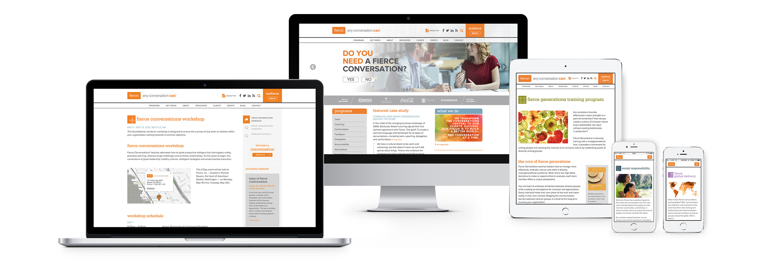
Explore fierceinc.com on Any Device
Not only is the site responsive, it’s adaptive – using object-oriented design, a color-adaptive UI, and the “Rescue Widows & Orphans” JavaScript plugin to create seamless and pleasing design across devices.
Explore fierceinc.com on Any Device
Not only is the site responsive, it’s adaptive – using object-oriented design, a color-adaptive UI, and the “Rescue Widows & Orphans” JavaScript plugin to create seamless and pleasing design across devices.
Walking the walk.
If you’re a company teaching others how to communicate, your very own website better communicate well, too. Fierce needed a full redesign and build of their site that would reflect their ambitions and philosophy.
Not only all that, but they needed it to be flexible. The team at Portent delivered with this clean, responsive, adaptive, integrated, user-friendly, and owner-friendly site.
Natural animation & meaningful transitions.
Animation should never be without meaning. Instead, it should provide value to the user, signaling an action, or a path, and it should be natural. (Just because we can animate something to defy the laws of physics, doesn't mean we should.)
Adding animation to the programs listing page helps the page feel lively, but the animation doesn't distract from the content because it feels natural. For example, if an item falls off the page, it does just that: it falls as if it were caused by gravity. And, when objects animate into view, they do so in the same path we would read them: top to bottom, left to right.
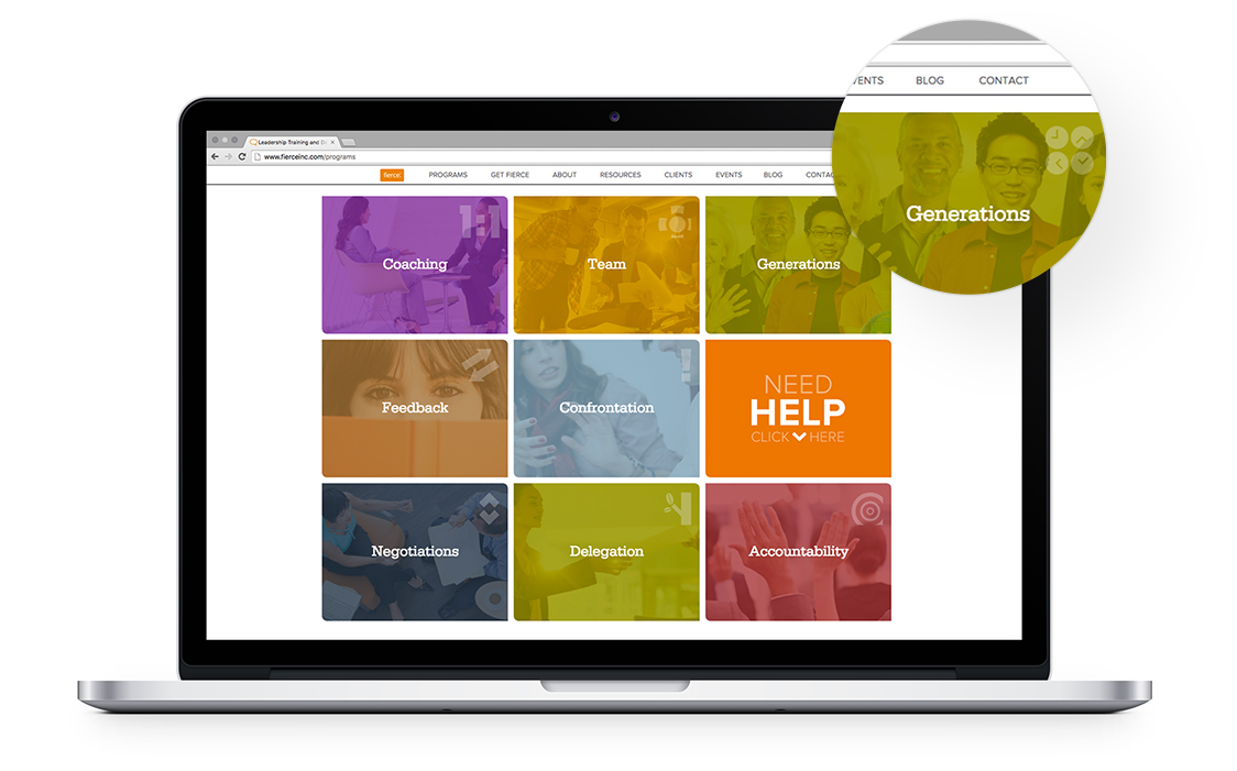
Way-Finding Through Color
Each program in the listing page has a dedicated color. This case highlights the “Generations” program, with its particular shade of green.
Way-Finding Through Color
Each program in the listing page has a dedicated color. This case highlights the “Generations” program, with its particular shade of green.

Way-Finding Through Color
On the program page, the particular green highlights the heading and the associated icon, both of which complement the featured image.
Way-Finding Through Color
On the program page, the particular green highlights the heading and the associated icon, both of which complement the featured image.
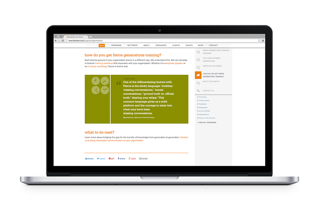
Way-Finding Through Color
If there are any special features on the page, such as a testimonial, it, too, will be highlighted in the associated color.
Way-Finding Through Color
If there are any special features on the page, such as a testimonial, it, too, will be highlighted in the associated color.
Color-adaptive way-finding to facilitate user experience.
Just like animation, if you’re going to “go big” with color, make it meaningful. And, one great way to leverage color is to use it for way-finding. In this case, each tile on the program listing page is a unique color. Importantly, the color is not arbitrary, and it coordinates with the featured image selected for each program page. The color is attached to the image, and that color populates automatically to the program listing page. This builds continuity across the site that, just like color-coordinated subway signage and maps, helps the user stay oriented and get exactly where they want to go next, with ease.
The header and sidebar team up for integrated site navigation.
Why not take the header and sidebar to the next level, and integrate site navigation as a coordinated, animated front? Keeping with the organizational principles we’ve come to expect, the header features links to all the “top level” pages on the site, and the sidebar offers access to “intrapage” navigation. But, with scrolling, the header collapses, maximizing space for the content, while still keeping its links available. The sidebar, in turn, pins to the header so that its content, too, can always be accessed.
Of course, as discussed above, the animation of these features mimics the physical world so that it feels natural, not forced, or gimmicky. As the user scrolls, it is as if the sidebar is a rubber block sitting on a board that is the page: the block moves along with the board, until it bumps into the header, and springs down in a reverberating action.
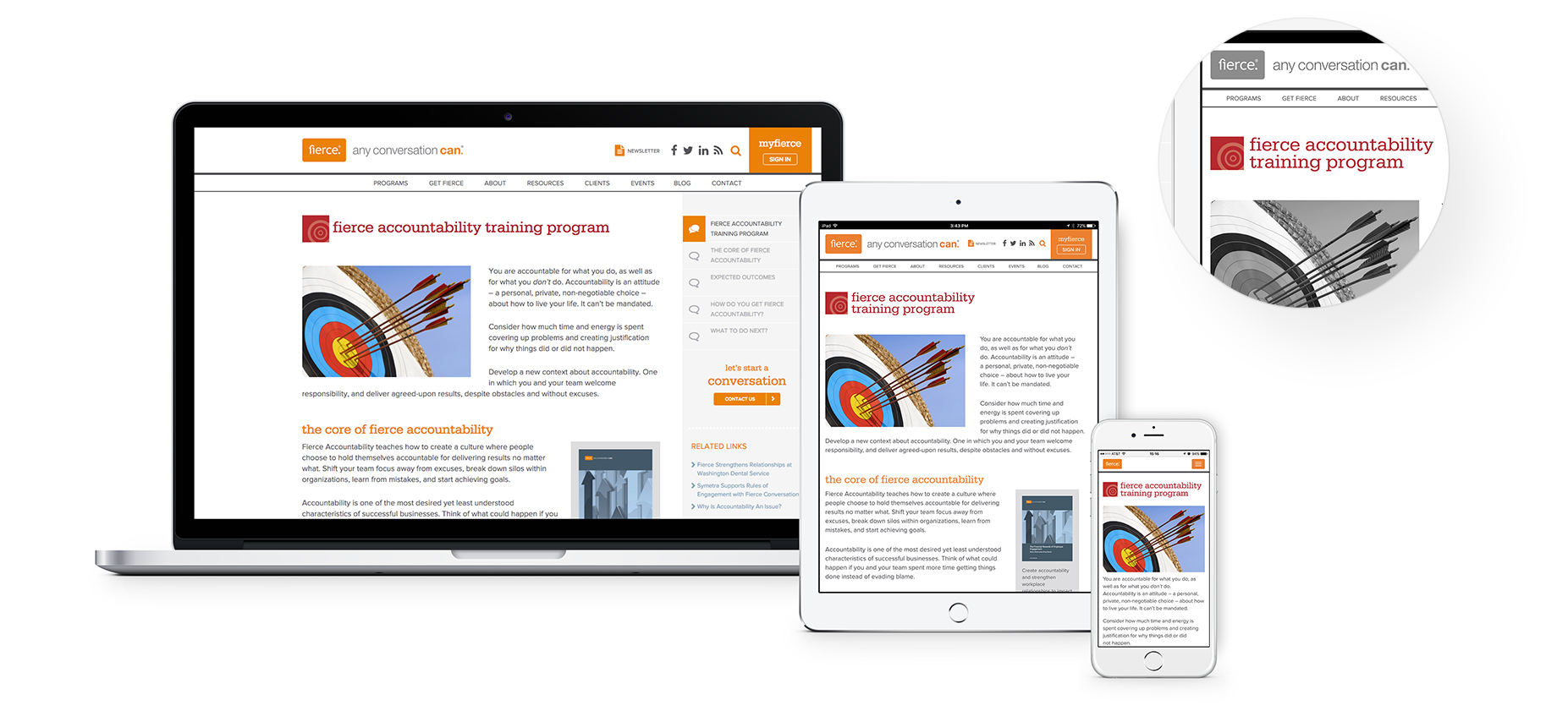
A Responsive Smart JavaScript Plugin: Rescue Widows & Orphans
Of these three devices, only the iPad requires the “Rescue Widows & Orphans” to activate. On the Macbook Pro, the screen width is generous, and the heading “fierce accountability training program” fits on one line with ease. However, the pixel width of the iPad is such that “fierce accountability training” fits on one line, and (without the custom plugin) the word “program” would be left as an orphan. No one wants that, so the plugin pulls the word “training” to the second line, creating better typographic design and user-experience.
A print media solution for the digital world.
Though more commonly known in the world of print media, words that fall alone to the last line of a paragraph or heading are referred to as “widows” or “orphans.” In a text-heavy site, attention to typography is especially important, but with a responsive site, this can be difficult to control. Rather, it was, until we solved that challenge with a custom JavaScript solution that we wrote, Rescue Widows & Orphans.
Essentially, the script scans a page and pulls a word down from the penultimate line to prevent the widow or orphan from remaining. The solution is both dynamic and context-sensitive: if pulling a word down to the last line would negatively impact the layout as a screen narrows, the script detects this and turns itself off to preserve the design.
Hey, we hope you liked our work!
Would you like to check out the services we offer?


Can we help you with anything?
Or, would you like to join our (rarely used) mailing list?
Feel free to reach out with any questions you may have for us about our services, our work, or anything else that’s got you curious.