
Branding, Content, Digital
Responsive Web Design & Development
Board & Vellum Website: Your Advocate for Great Design
An award-winning Seattle architecture and design firm needed a new website to showcase their work with the gorgeous, high-resolution imagery it deserves. Custom-built on the E7 Series 3 platform, the component-based, drag-and-drop interface empowers B&V’ers to manage content production and craft new page designs with ease.

Board & Vellum Website in Responsive Mockup Suite
An easy-to-use platform for a content-heavy site.
Board & Vellum is an award-winning design firm located on Capitol Hill in Seattle, offering integrated services in architecture, interior design, and landscape architecture. As one of the Pacific Northwest’s fastest-growing private companies, its old website was falling quickly behind: adding new content was a chore, burdened by dated code that wasn’t playing nice, even with itself.
But, unlike many architecture firms, Board & Vellum’s website is much more than just a portfolio of work. Rather than a collection of images growing only at the pace of architectural projects completing, boardandvellum.com also features a helpful and approachable blog full of tons of great content read all over the world.
Plus, their content strategy calls for new posts going out bi-weekly. All this means the site needs to be easy super easy for B&V’ers to work with, and also adaptable so it can stay current as the company evolves.
A cross-fade hero reveals a diversity of project types.
Board & Vellum not only offers a variety of design services, but takes on projects of vastly different scales and styles — so, how do you choose which one image is appropriate for the home page? You don’t. Instead, we designed a cross-fading hero component so that all of Board & Vellum’s project types are represented. The images can be swapped out or reorganized on a whim, with a quick dip into the CMS.
While the images gently fade from one to the next, the brand remains present with a logomark overlay that highlights the introduction to the company, and includes a CTA button offering a quick path over to the portfolio hub.
This layout is not only helpful for the human visitors to the site (heat map testing on the old website helped us infer what B&V’s users wanted to see and when), but it’s helpful for the robot visitors, too. Why do we care about the robots? Because designing for humans and robots alike helps your webpage jump from who-knows-where deep in Google search results pages, to right where you want to be.
Side Note: We’ve sped up the transition between images in this video rendition so you can experience the cycle in a nutshell, and (of course) the resolution is lower in this video than the live site, so be sure to check it out over on boardandvellum.com for the full experience.

Green Lake Urban Infill
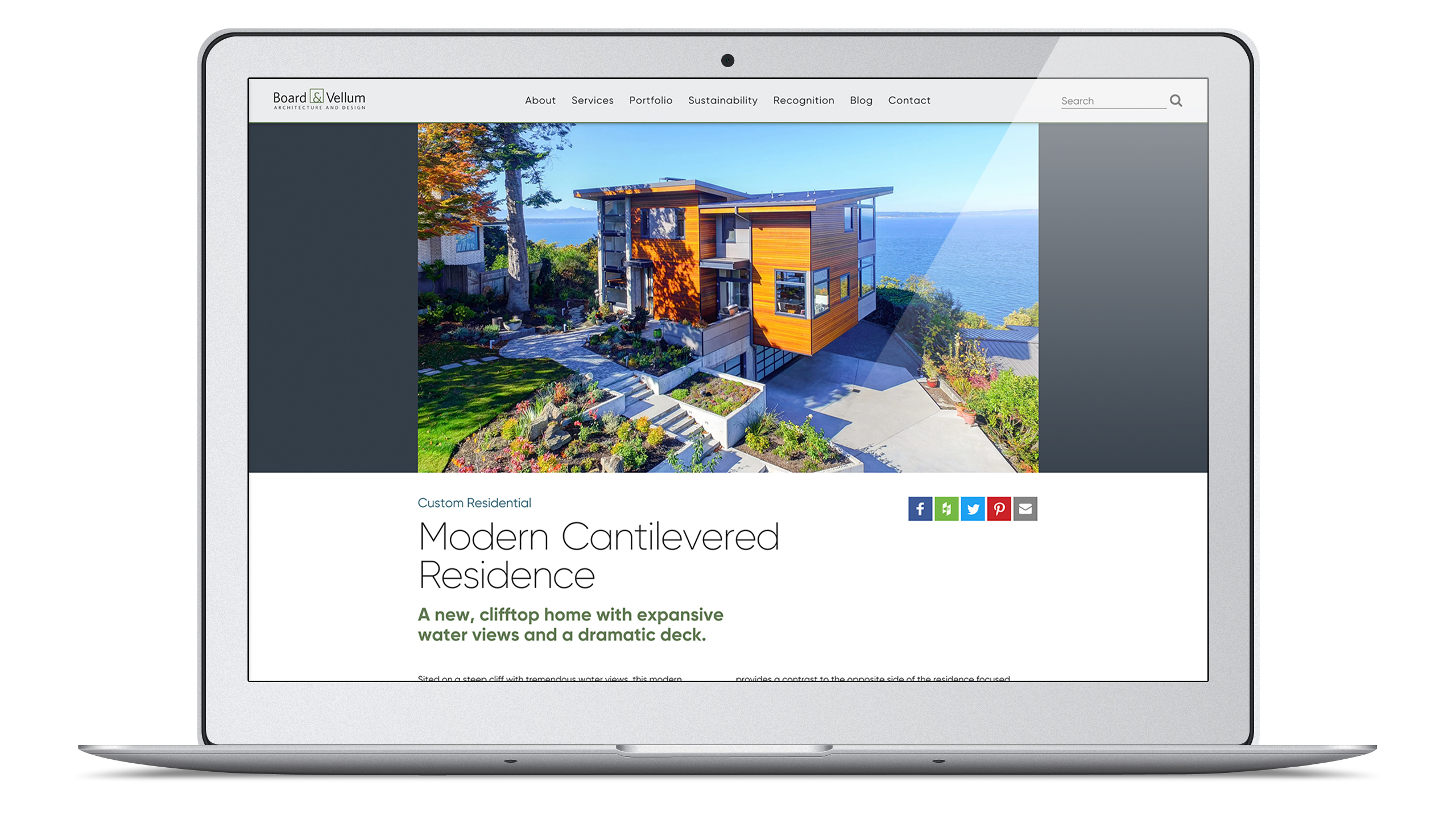
Modern Cantilevered Residence
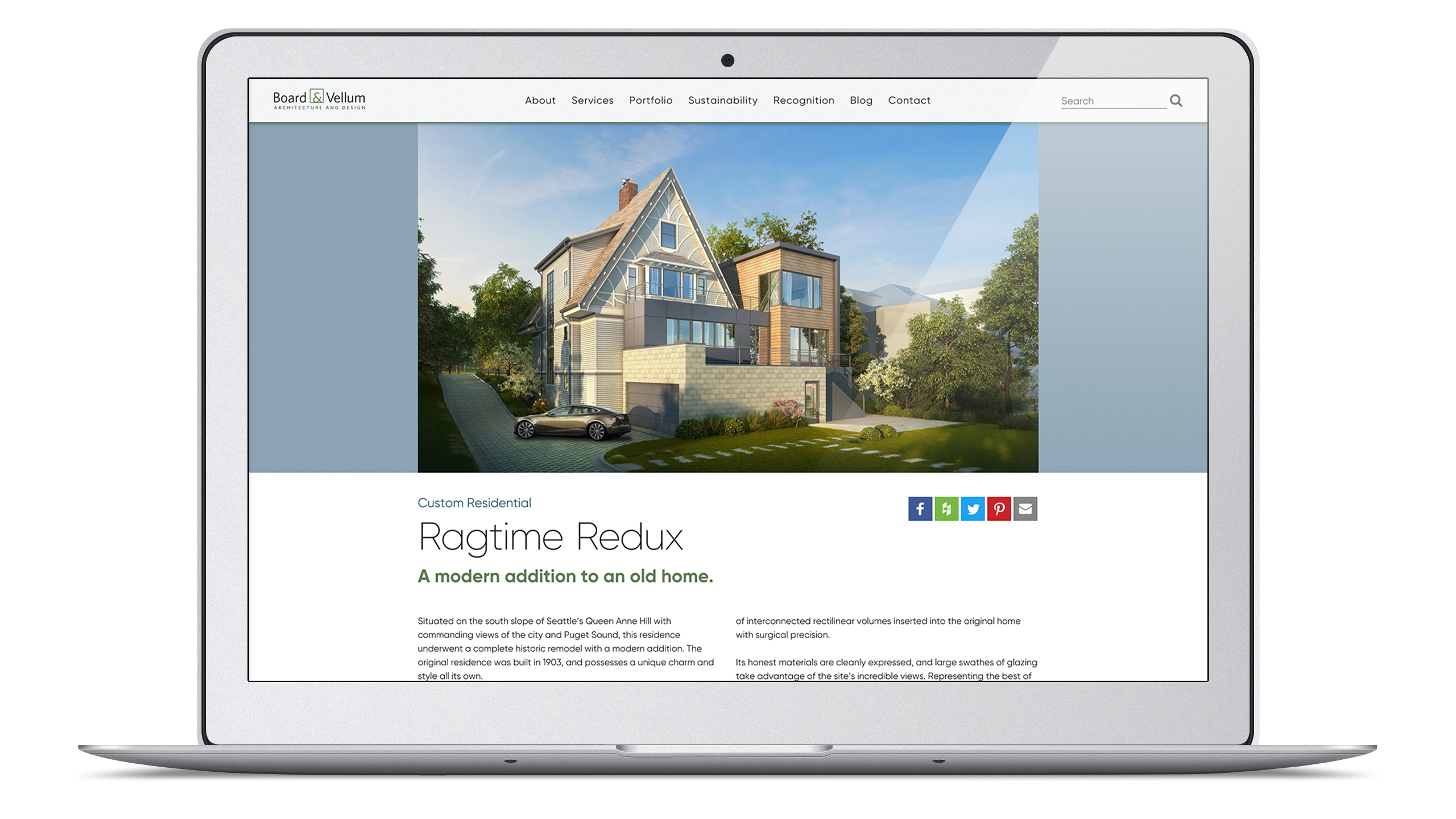
Ragtime Redux
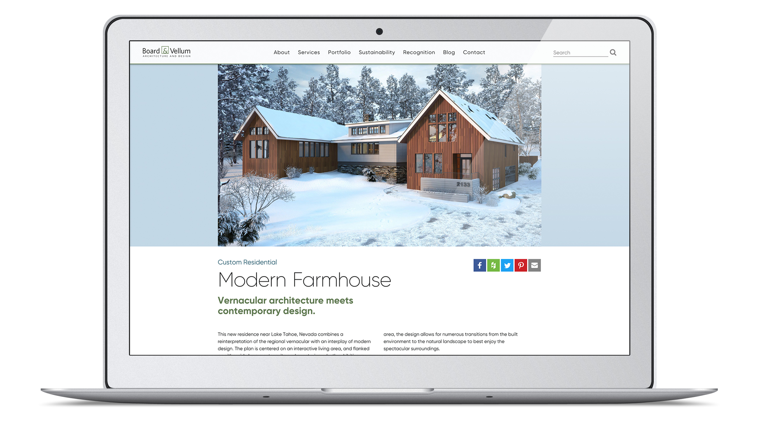
Modern Farmhouse
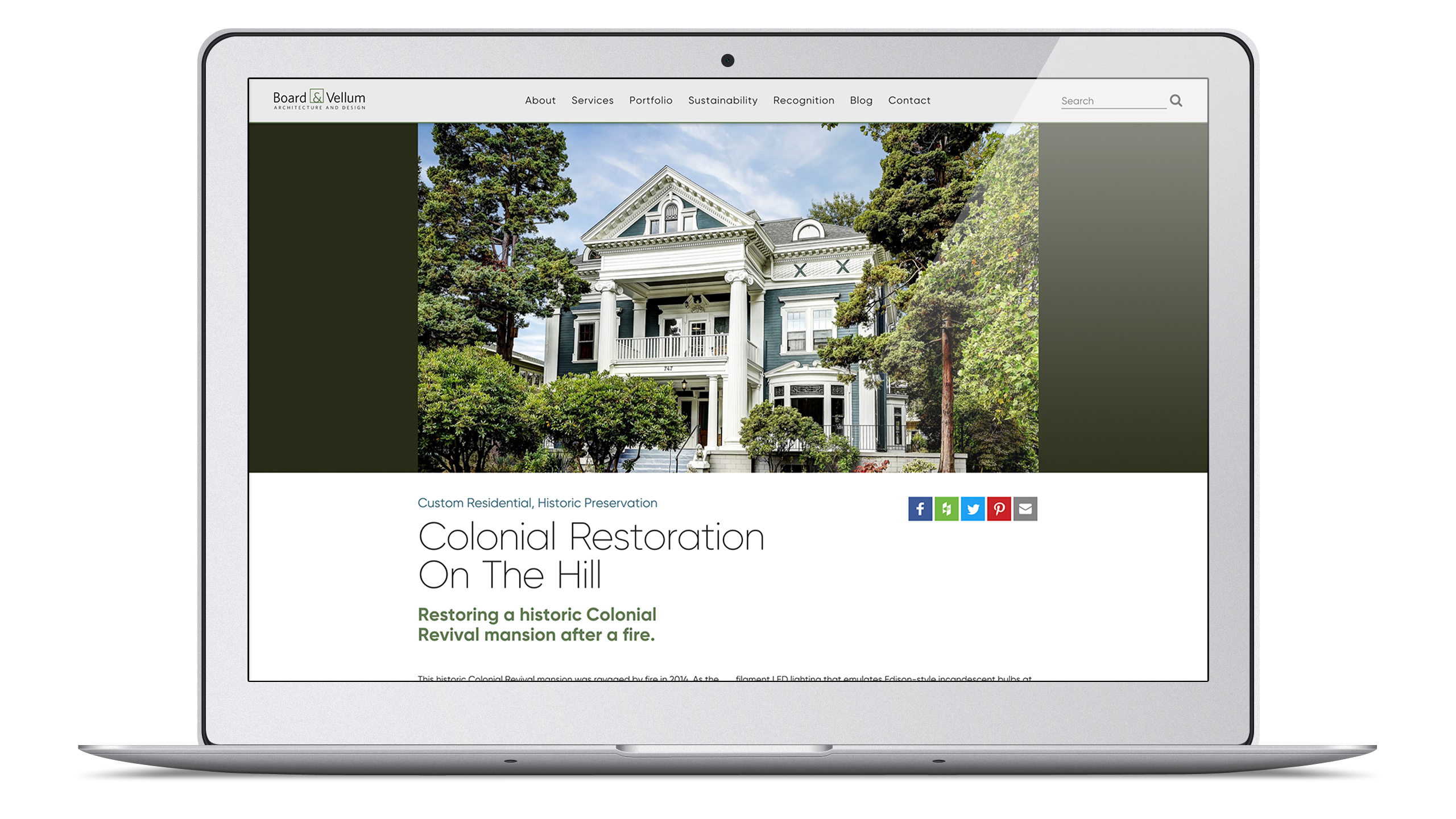
Colonial Restoration on the Hill
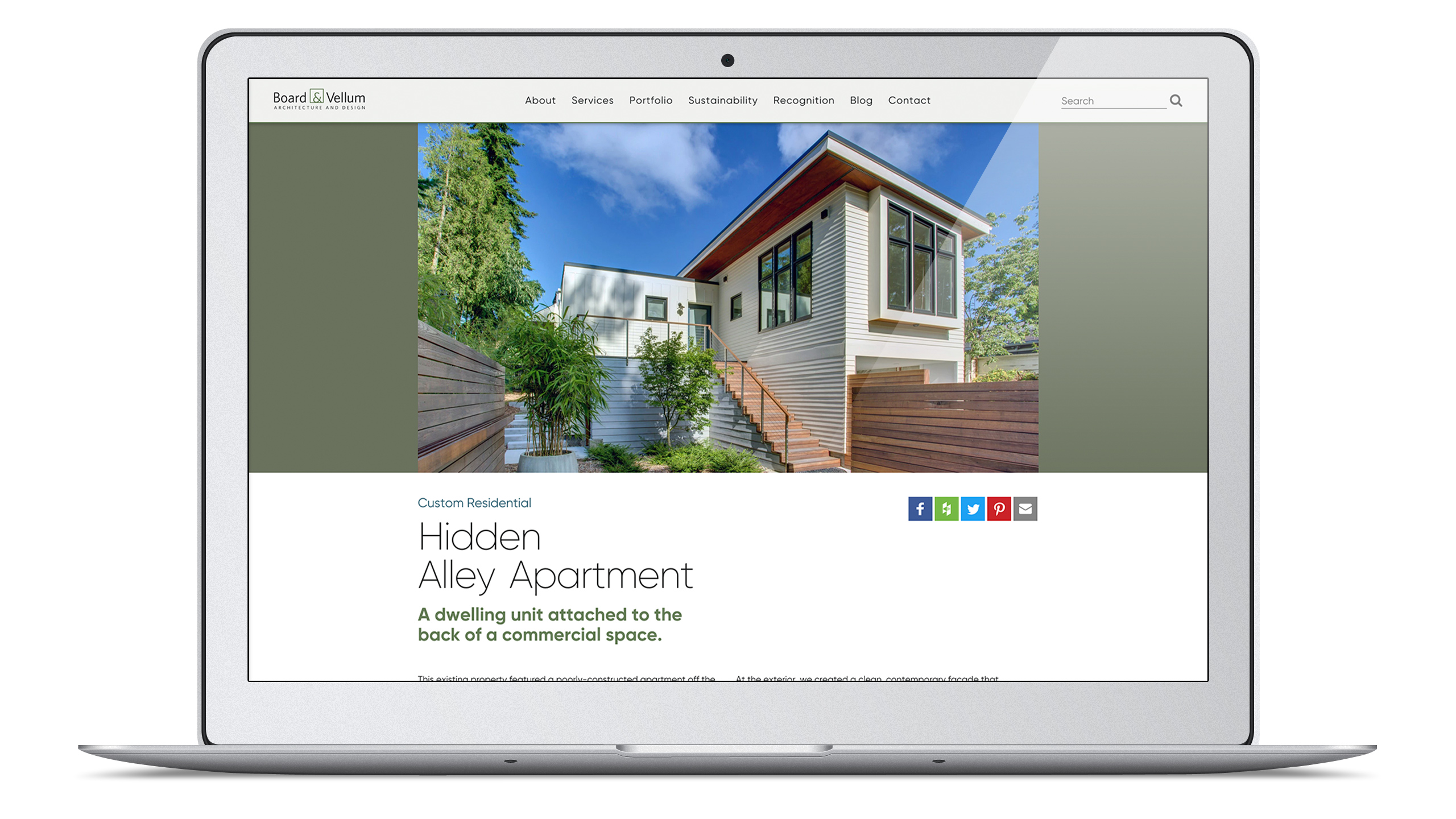
Hidden Alley Apartment
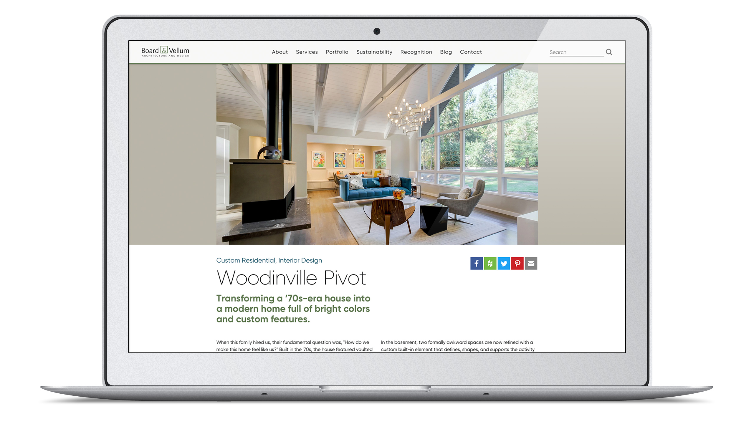
Woodinville Pivot
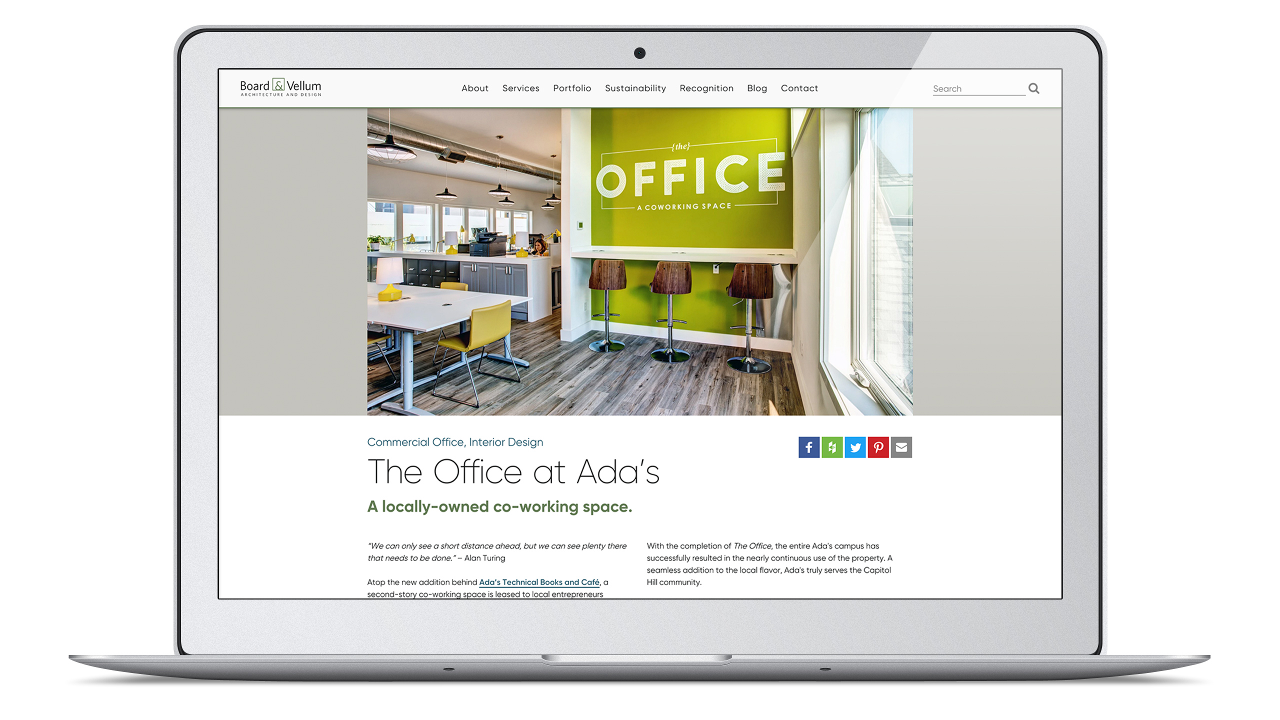
The Office at Ada’s
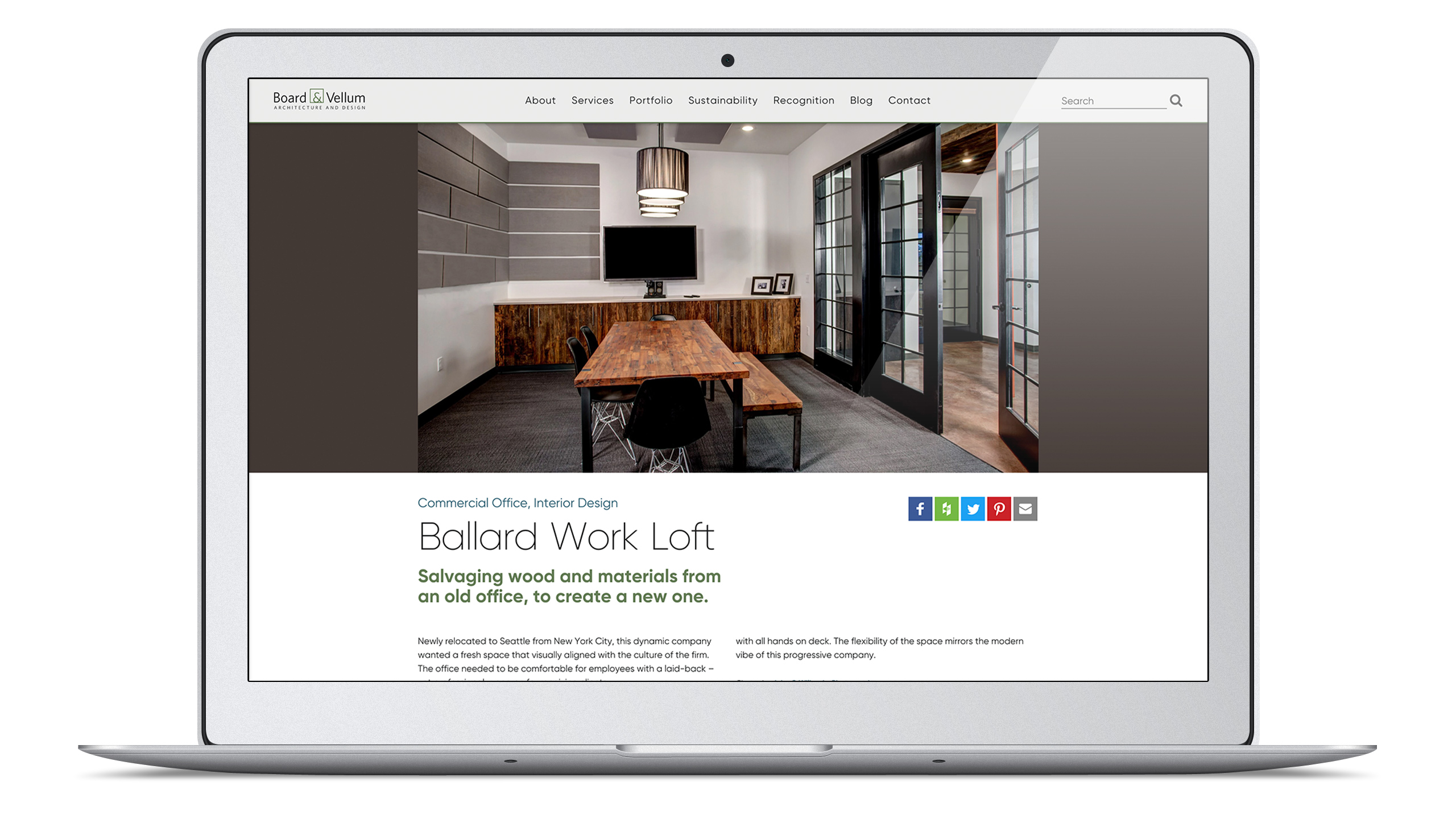
Ballard Work Loft

Capitol Pacific
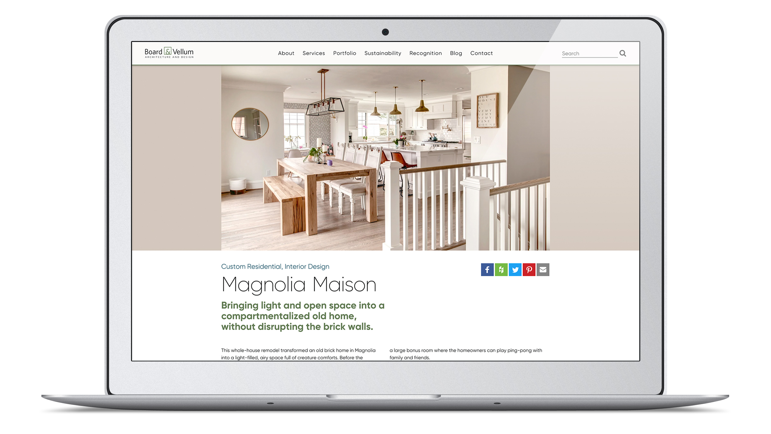
Magnolia Maison
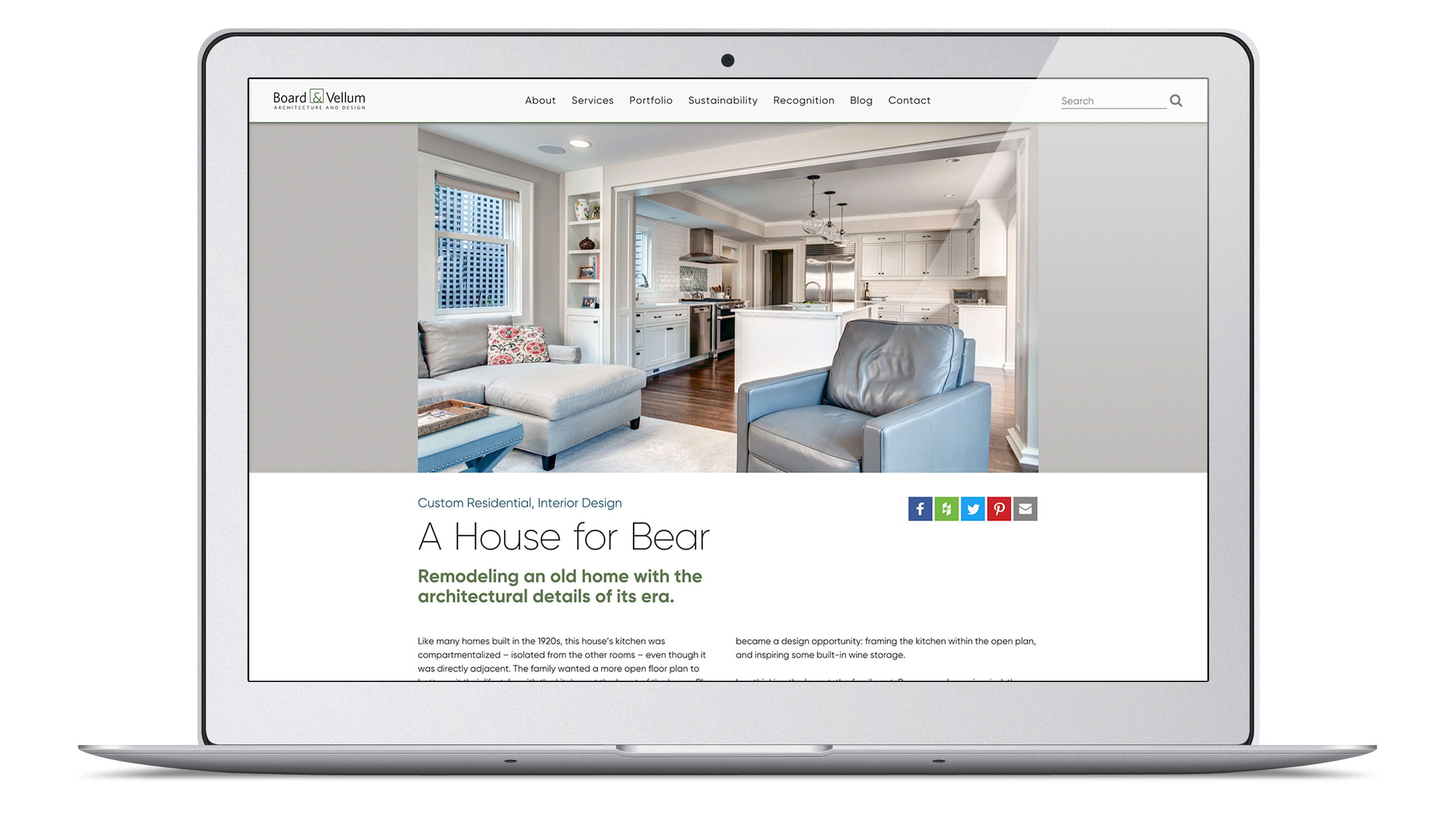
A House for Bear
A color-adaptive hero component helps create that “print media” feel.
One of the underlying design intentions for the E7 Series 3 platform is to emulate print media standards in a form that performs well in the digital sphere.
For the individual portfolio projects on the B&V site, the digital challenge was: how do we present the hero image for a project so that not only does it render fully (without cropping) on smaller devices, but also not appear too small on a larger screen, with nothing but tons of blank space in the margins? Introducing a full-bleed, color-adaptive hero component solved this challenge.
How do you support a color-adaptive, magazine-style layout in a web-based portfolio? You automate, of course!
The first time an image is loaded (which happens when the project is still in draft form), client-side JavaScript processes the image and uses known algorithms to identify the dominant color of the image, along with an accompanying palette of supporting colors. The process occurs asynchronously behind-the-scenes and applies to every image uploaded to the platform. This opens up the opportunity for further color-adaptive integration to occur in the future without the overhead cost of processing all these images at once. The data is collected, processed and stored incrementally so we can dream big about future design features.
Since the underlay color for each project hero image is generated by an algorithmic study of the image itself, each project feels like itself when presented. If there were only one color underlay used for all projects, that color would have to be very neutral — some projects would fare alright, but many would feel like they clashed with their backdrop. Instead, the color-adaptive hero component allows each project to feel unique and presented at its best.
Color-adaptive interfaces are becoming more common, and you’ll notice them popping up now, even among mainstream sites like Pinterest and Google. But, hey, we’ve been rocking color-adaptive interfaces since 2013.
The “perfect gallery” uses a masonry layout, but with no jagged edges.
Most masonry galleries start with a row of images perfectly top aligned, with subsequent images filling in below. The columns are of a consistent width — as well as the gap between each image — but the height of each image varies. Due to this variation, ultimately, the final row of images forms a jagged bottom edge to the gallery. Some people don’t mind this look, or they have to use it because the gallery images are so varied that there is no way around it.
But, Board & Vellum didn’t want that jagged edge, and we didn’t want to crop the images into square thumbnails. Plus, the galleries for most projects included images in both landscape and portrait orientation.
We accepted this challenge, and found the gallery could have both landscape and portrait images and be “perfect” if the images were all cut into a combination of 2x3 and 3x2 aspect ratios, then curated both in number and in order to populate the gallery “just so.” The result will have perfect alignment of the thumbnails, both on top and on the bottom. It takes a little extra curation, but it’s worth it for the clean, organized look.
Defining a site structure helpful to both humans and robots.
The new Board & Vellum site built on the E7 Series 3 platform allows the B&V team to realize their goals because it provides the collection of different post types they needed. These include services, portfolio projects, blog posts, team members, recognition stories, and sustainability practices, to name only a few.
When we originally designed & developed the “Topics Hub” infrastructure for the platform, we built it as a way of formalizing and accessing a cross-section of the site’s content in a single view, mapping the information architecture across the various types of content, so that all our favorite robots, site spiders, and (duh) the humans, could understand what Board & Vellum was offering.
That has gone to plan. But, the other great upside is: B&V’s content and marketing team now uses the Topics infrastructure to take the pulse of B&V content production, content management, and content strategy. We’ve already observed savvy external users doing the same.
Dual Silver W3 Awards
We are more than excited to announce, this project won dual Silver W3 awards!
The W3 Awards is sanctioned and judged by the Academy of Interactive and Visual Arts (AIVA) and honors creative excellence on the web. Now in its thirteenth year, the 2018 W3 Awards received over 5,000 entries competing for the honor.
For more details, hop on over to our recognition page!
And, guess what? We’ll add more soon.
We are so excited to launch this project on our portfolio that, hey, we’re getting this much content up here on the interwebs right now, even though we are positively itching to add more. We know, we know — this happens all the time! We feel you, we wish we could keep up with our portfolio documentation, too. But we give our clients top priority, and that means portfolio work comes later.
So, coming up at a later point… tune back in to read about the brand work incorporated into this project, the massive pile of content production that our very own Rachel did while wearing her B&V hat, and also to check out some mind-blowing comparisons of before-and-after for the site.
We hope to see you soon.
Hey, we hope you liked our work!
Would you like to check out the services we offer?


Can we help you with anything?
Or, would you like to join our (rarely used) mailing list?
Feel free to reach out with any questions you may have for us about our services, our work, or anything else that’s got you curious.