
Branding, Digital
Adaptive Reuse Web Design & Development
Portent, Inc. Website Evolution
The Portent, Inc. Website Evolution was completed via Portent, Inc. for Portent, Inc. You read that right: sometimes a company needs to work on it’s own website. (With a little outside critique.) And why not? With a little remodeling, an old site can get a fresh new look, along with some great new functionality. We welcome you to experience the project in the vignettes below; or, visit live site.
Harnessing the concept of adaptive reuse to upgrade a website.
Recently, portent.com underwent some adaptive reuse! As in so many cases, you know you need a website revamp, but you don’t have the time or resources to devote to a full redo. Luckily, just like physical architecture, if you’ve got a project that was built with “good bones” in the first place, it may not need to be a total tear down. Why start from scratch when you can refine and reinvest in what you already have?
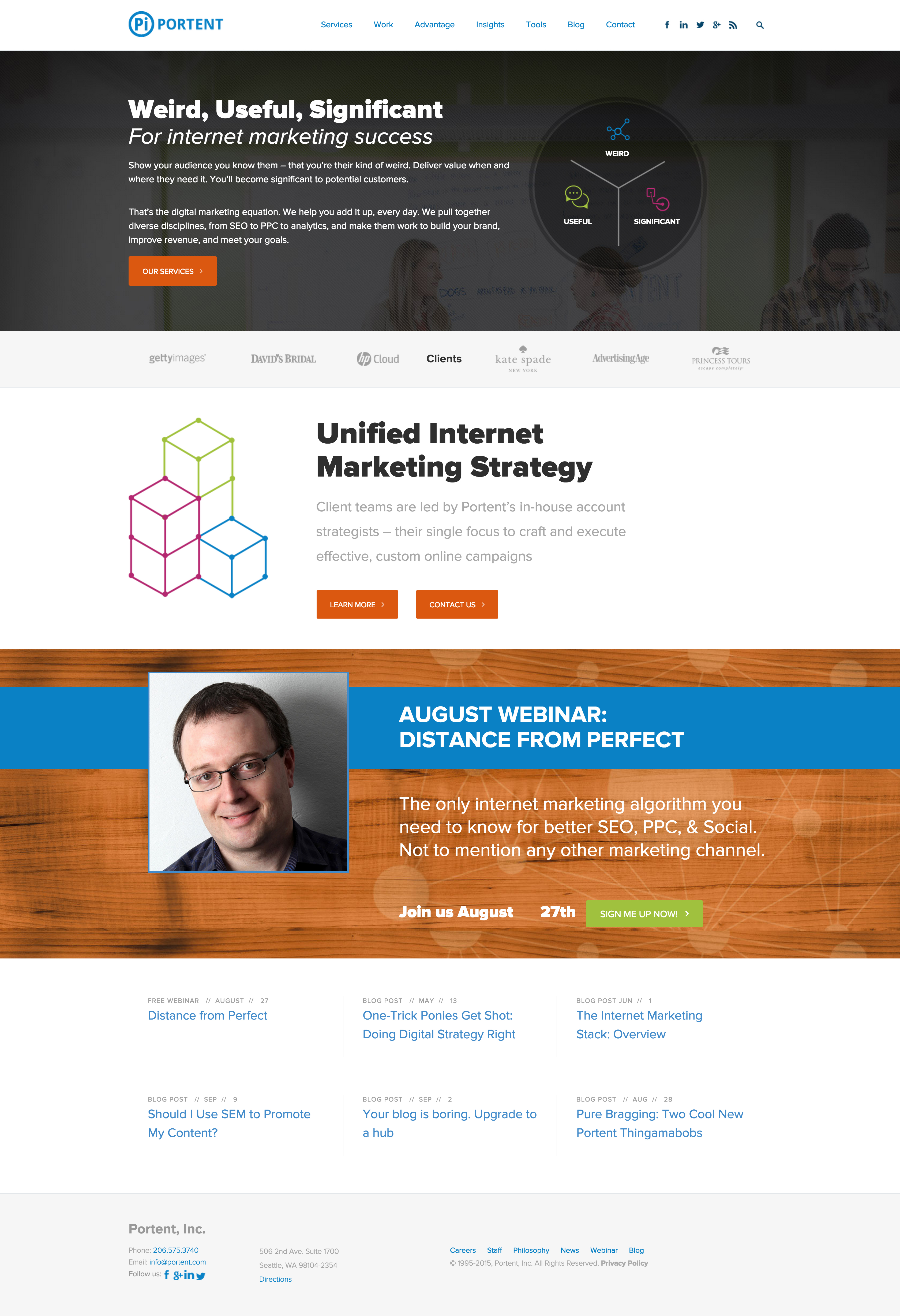
Portent.com Adaptive Reuse: Home Page – Before
Before the intervention, the home page had too many focal points and too little design.
Portent.com Adaptive Reuse: Home Page – Before
Before the intervention, the home page had too many focal points and too little design.
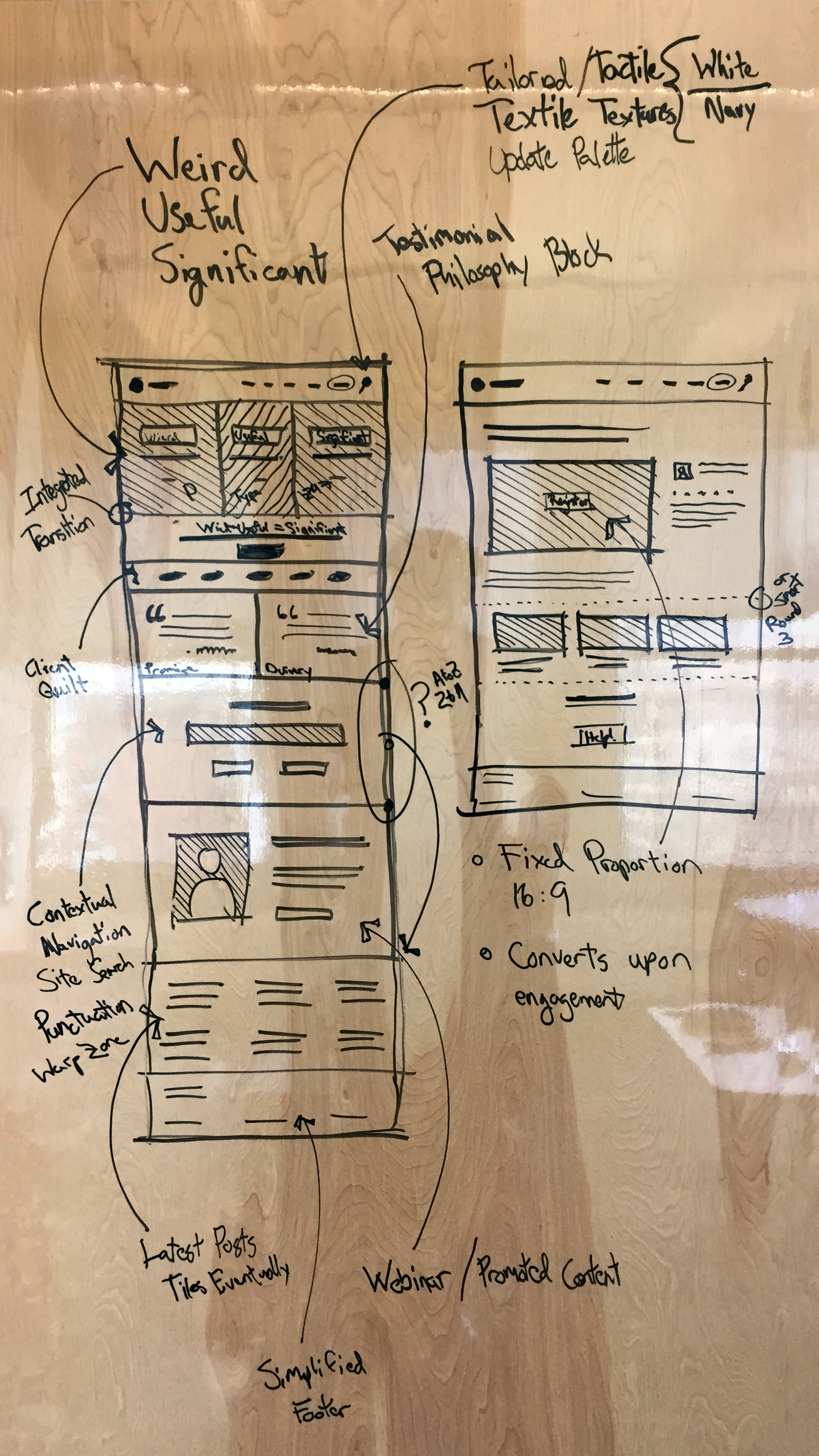
Portent.com Adaptive Reuse: Early Concept Sketch for Home Page and Training Hub
Rather than a waterfall process, we iterated between designing & developing in-browser, and sketching ideas on the dry erase board.
Portent.com Adaptive Reuse: Early Concept Sketch for Home Page and Training Hub
Rather than a waterfall process, we iterated between designing & developing in-browser, and sketching ideas on the dry erase board.
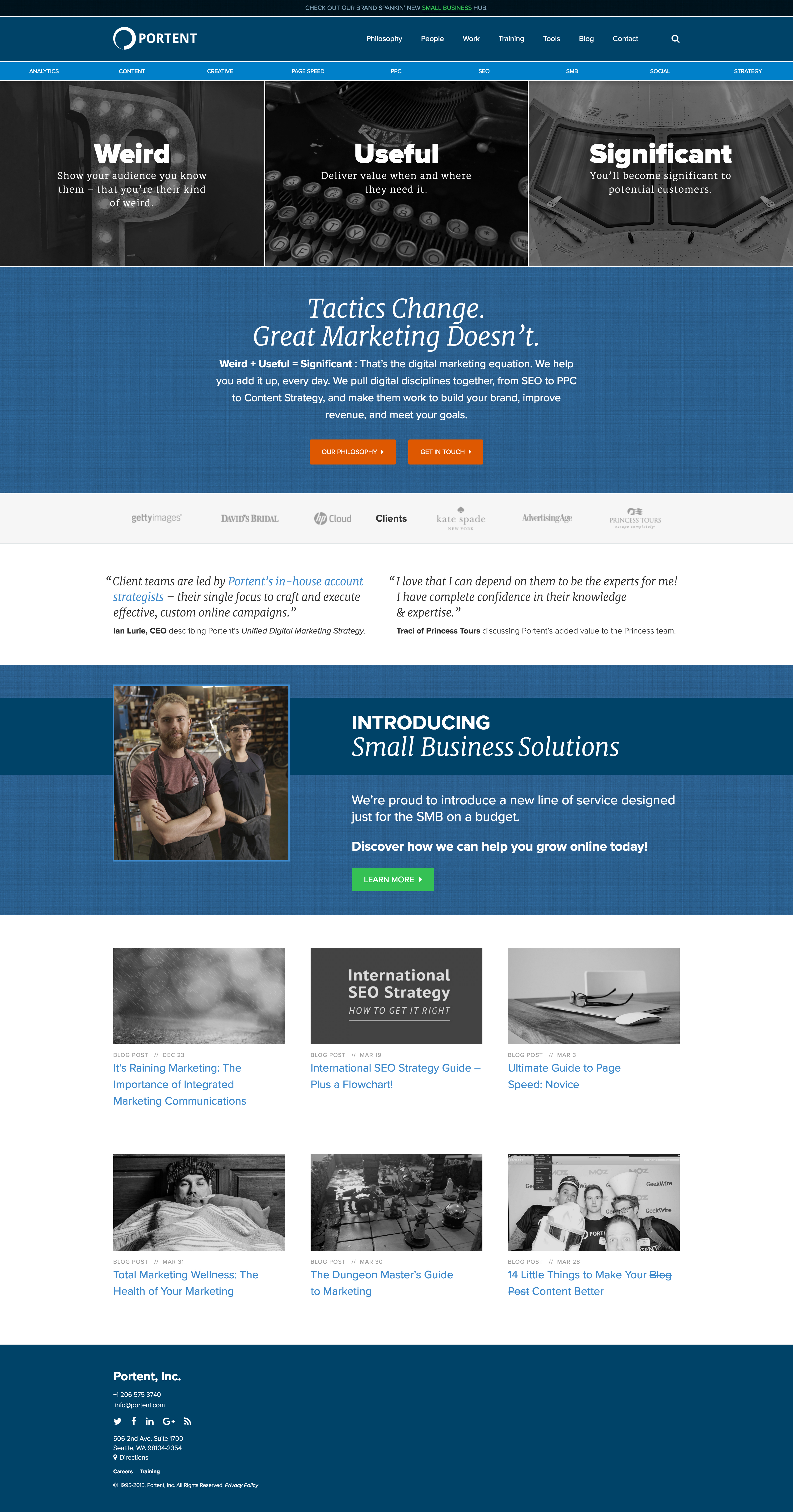
Portent.com Adaptive Reuse: Home Page – After
After: a unified, considered design, which allows the user to explore the site with ease.
Portent.com Adaptive Reuse: Home Page – After
After: a unified, considered design, which allows the user to explore the site with ease.
So, what exactly is adaptive reuse?
Adaptive Reuse is a strategy borrowed from traditional architecture (you know, buildings). With roots in sustainability, the strategy can reduce costs, minimize rework and waste, and repurposes what already exists, all while maintaining a high-level of customization and quality. Adaptive reuse projects in the digital realm work with – and within – the existing structure of the experience: interventions may be global or surgical in scope.
Crucially, adaptive reuse doesn’t exclude the concept of an addition. In the case of physical architecture, we often mean adding square footage: maybe building up, by adding a second story to your home; or building laterally, by bumping out the kitchen; or adding unenclosed space, like a great deck to soak in the sun. When it comes to digital experiences, the analogous and corollary additions to the context still apply: maybe we build up, by creating new, global functionality; or build laterally, by expanding existing features; or maybe we add something entirely fresh, like a brand new, top-level page that ties everything together.
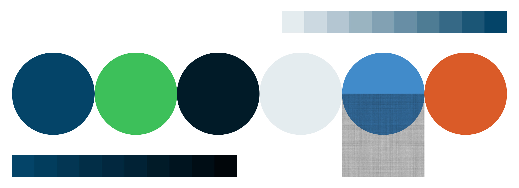
Brand Colors, Shades, Tints & Textures
As an evolution from the earlier color palette, Portent’s original, vibrant blue makes the leap forward as the first color in the new palette. With a textural overlay, it becomes two key material elements. A light tint, a mid-range, and a deep shade of the original blue complete the base of the palette. The base is complemented with a pair of highlights: a lush, grassy, green and a vodka-saucy orange.
Not just a color palette: a materials palette.
For a richer experience, you need more than just a color palette. As with designing for physical spaces (think architecture and interior design), flat color isn’t enough to experience wholeness in a two-dimensional digital space: you need colors, shades, tints, and textures.
Respecting the nature of evolution (not just tossing all the old colors to the curb and starting over) we based the new brand colors on Portent’s original, chief brand color: a vibrant blue that defined the logo for years. From this original blue, the palette fills out with a lighter tint, two darker shades, and then two highlight colors to complete the spread: a lively green and an earthy orange. When needed, incremental tints and shades of the darker blue provide nuance to support the varied contexts where the brand may be represented.
As a last note, we introduced a tactile quality with a “linen” texture as an optional overlay to the classic blue. The resulting material scheme is friendly and approachable, while still projecting the mature and professional identity merited by a 20-year-old company.
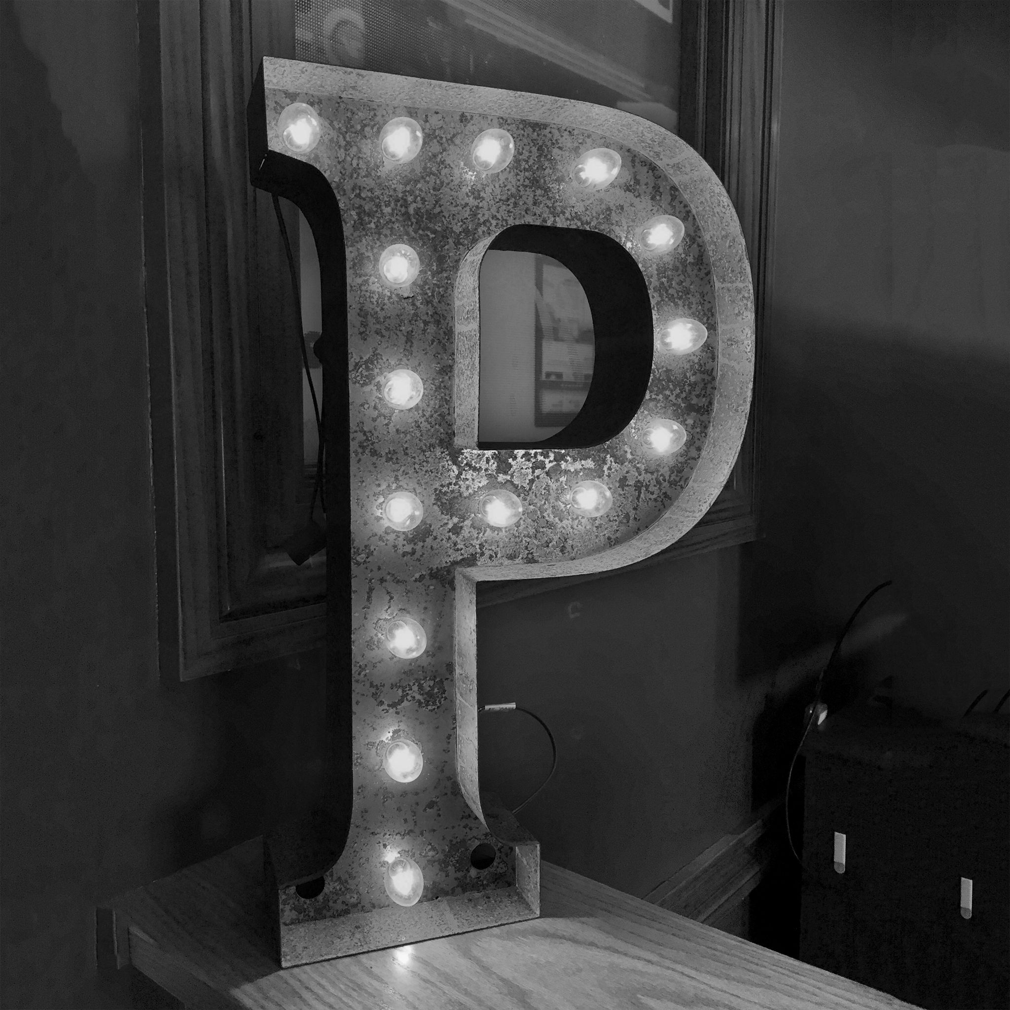
A “Portent” P from a Vintage Sign
Portent’s been around for a while; make it natural and love the old with the new.
A “Portent” P from a Vintage Sign
Portent’s been around for a while; make it natural and love the old with the new.

A Family Heirloom
In the crash of 1929, the grandfather of Portent’s founder and CEO, Ian Lurie, was laid off from his job at a newspaper. He was allowed to keep his typewriter, and he carried it out of the building, as his colleagues carried out theirs. That very typewriter now lives at the offices of Portent, a physical symbol of personal and national history.
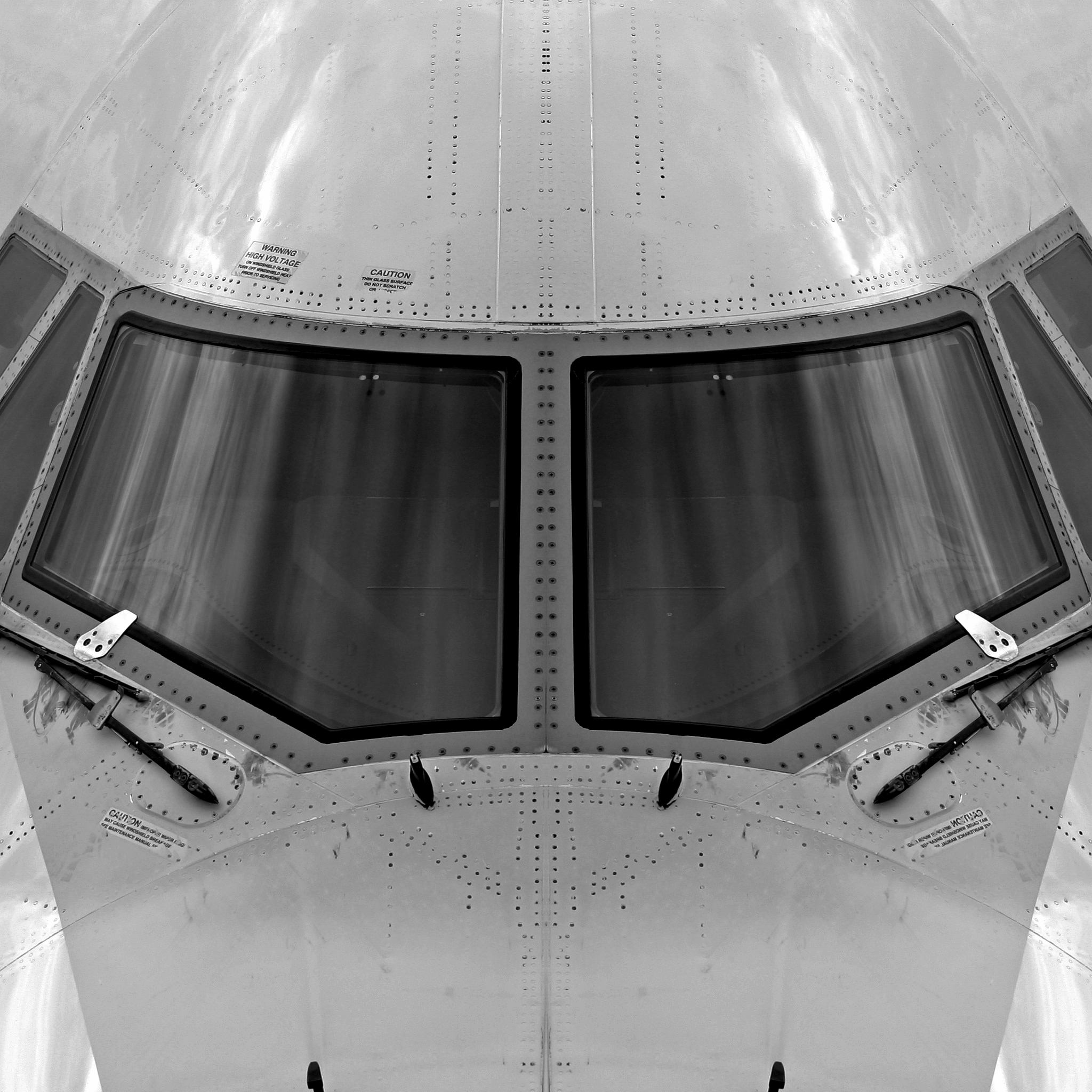
A Classic Product
Ian Lurie looks to the Boeing 747 as a classic design that acts as a foundation for his philosophy. The 747 serves as equally as a workhorse for the public, and as a top-level agent for exclusive services. Whether tasked with carrying cargo or passengers on long-haul, economy voyages across the globe, or whether tasked with transporting the Space Shuttle, or the President of the United States, the 747 steps up to the plate.
Source media that has embedded meaning, even it’s not obvious.
Certainly, there is a time and a place for stock imagery. But, let’s all take note: that time and place is not right now, at the top of your home page.
Even if the overwhelming majority of visitors to your site never realize that the images they view hold cogent, personal or historical relevance — however nuanced — you will offer a richer digital experience to your clientele if you create your own media.
An animated pinned header and an article status bar: cool!
When the header remains pinned to the top of the page, even while the user scrolls, not only does the branded experience remain consistent, but accessibility and navigation are greatly improved. Beyond a simple pin, the header is animated to switch between minimized and expanded states, based on subtle browsing cues from the user.
On the blog, there is an additional component that comes into play: the article status bar. You’ve seen these before, right? They provide visual and time-specific cues for where you are in the article, updating as you scroll. This one is dynamically assembled from the information on the page, showing the title, author, and estimated read time — plus, it always keeps those trusty social share buttons handy.
We can (and did) get into way more details about the specifics of these components, so if you’re intrigued, hop over to the blog where Blake tells the whole story.
Immersive site search: taking search to the next level.
Beyond responding to scrolling cues from the user, we went further, and introduced Immersive Site Search, which responds to typed cues. This means, that no matter where you are on the site, without needing to find a search field, you can just start typing to find what you need.
With that first keystroke, an immersive overlay appears for search and navigation input. (If you didn’t mean to bring up the overlay, no big deal, just hit escape, or click the close icon.) Once you hit enter, one of two things happens. If you typed a word or phrase that we’ve included in the site’s “dictionary,” you are taken directly to the associated page: typing “small business” takes you to Portent’s Small Business Hub, for example. In the case of typing something without an associated page, you will instead arrive at the Site Search Results Page, where you can scroll through to find your answer.
If we look back to the concept of Adaptive Reuse, introducing this functionality to the site was an addition: we assessed the existing conditions, remodeled to make great improvements, then added on a new feature that not only ties it all together, but is just plain fun to use. Pop on over to Portent.com and see for yourself!
Fun Fact: We’ve integrated Immersive Site Search on Emerald Seven’s site, too. Go ahead, type something...
Still hungry for more about this project?
Go deep, and read more about it in our blog.

Hey, we hope you liked our work!
Would you like to check out the services we offer?


Can we help you with anything?
Or, would you like to join our (rarely used) mailing list?
Feel free to reach out with any questions you may have for us about our services, our work, or anything else that’s got you curious.