

Architecture
92nd Street Remodel & Addition: Early Design Sketches
Designing a house is no small endeavor, and visualizing ideas is key. Not everyone can imagine a space from an architectural drawing, so quickly executed graphic sketches can be very useful to communicate ideas as the design process unfolds. This collection explores an early phase of design for the 92nd Street Remodel & Addition.

September 15, 2013
Something Exciting in the Works
For the last nine-or-so months, I’ve been nose-to-the-grindstone on a huge project for us, hereby dubbed the 92nd Street Residential Remodel & Addition. It blossomed from a new couple wondering if they should remodel or move, to a full-house overhaul. In the next month or so, I’ll be headed to get Simrell+Scott’s first building permit, so, there is much work ahead! But, for now, I thought I’d share some of the sketches that have made up a portion of the design process for this project so far.
The completed 92nd Street Residential Remodel & Addition project is now live in the portfolio, if you want to see where it all ended up. There, and in the 92nd Street Residential Remodel & Addition: Before & After blog post, you’ll find more details about the narrative, the “Before” photos, and some beautiful “After” shots, so check it out!
When A Project Calls for a New Sketching Style
A cool side-effect of this project, as you’ll discover below, is that its needs have necessitated that I develop a new drawing style for certain circumstances. In the first sketches, you’ll find the usual sort of “wiggly line” architectural style. Although, since speed is crucial when you’re talking about billable hours, and these were only to help the homeowners visualize a potential solution very early in the process, they are far from my best finished work. Of course, it was driving me crazy that I was having to send drawings to our clients that I didn’t feel were “cool enough looking,” and I just couldn’t settle for it. So as you’ll see, I found a way to create digital sketches that I could produce fast enough that limited time was no longer an issue. The style is part graphic novel, and part flat design, and a bunch just fun and fast. In fact, the homeowners have found the sketches incredibly helpful in understanding the design, and, because they are so quick to produce, they think nothing of asking to have a sketch (or two, or three) to help them visualize any idea we are working on.
A Little Background
Let’s pause for a moment and I’ll fill you in on the backstory here. When the homeowners first approached us, they were considering moving out and starting fresh somewhere else because they couldn’t picture a way to remodel away the problems. So, our initial sketches were part of an architectural consultation to answer that classic question: To remodel, or not to remodel? (Ok, maybe not that classic.) But anyway, the first pass on the project was all about finding the most minimal intervention that would still resolve the issues at hand. If our ideas seemed feasible, and the budget suitable, then perhaps a remodel would be on the table.
To remodel, or not to remodel? (That is the question.)
The house itself has a bit of a storied past. (You’ll get my architectural pun here in a moment.) In brief, construction on the house began after WWII, but a shortage of funds soon necessitated that a roof be put on the daylit basement, which would suffice as a home until more money was saved. Later on, the first story of the house was added, and then decades later, the second story by new owners. As a result of all this (sans-designer) iteration, the house really needs not only an update, but also a bit of an overhaul to tie it all together.
A Possible Solution
The biggest complaint the homeowners have about their house, is that the front door opens directly into the dining room. Not only does this feel invasive and disruptive, but without transition space, there is even a problem with where to stash wet shoes and coats. (This is Seattle, after all. Things get wet here.) While tossing the idea around in their minds, the homeowners wondered if one of the bedrooms behind the kitchen could be converted to a dining room, or if a dining room could be added off the back of the house, taking over part of the deck.
This is Seattle, after all. Things get wet here.
While these were valid ideas to consider, they each had substantial downsides and didn’t resolve the problem at the source. Furthermore, secondary complaints were that there wasn’t enough natural light, and that there was no way to access the garage without traveling outside. Considering all these factors, our proposed solution was the addition of an entry foyer that would be full of windows, would separate the front door from the main space, and would allow for an internal link to the garage.
Floor Plans
So, let’s get visual. These floor plans focus on the entry and dining room, flanked by the garage, kitchen, and living room. The existing house is on the left, and a potential solution is on the right.
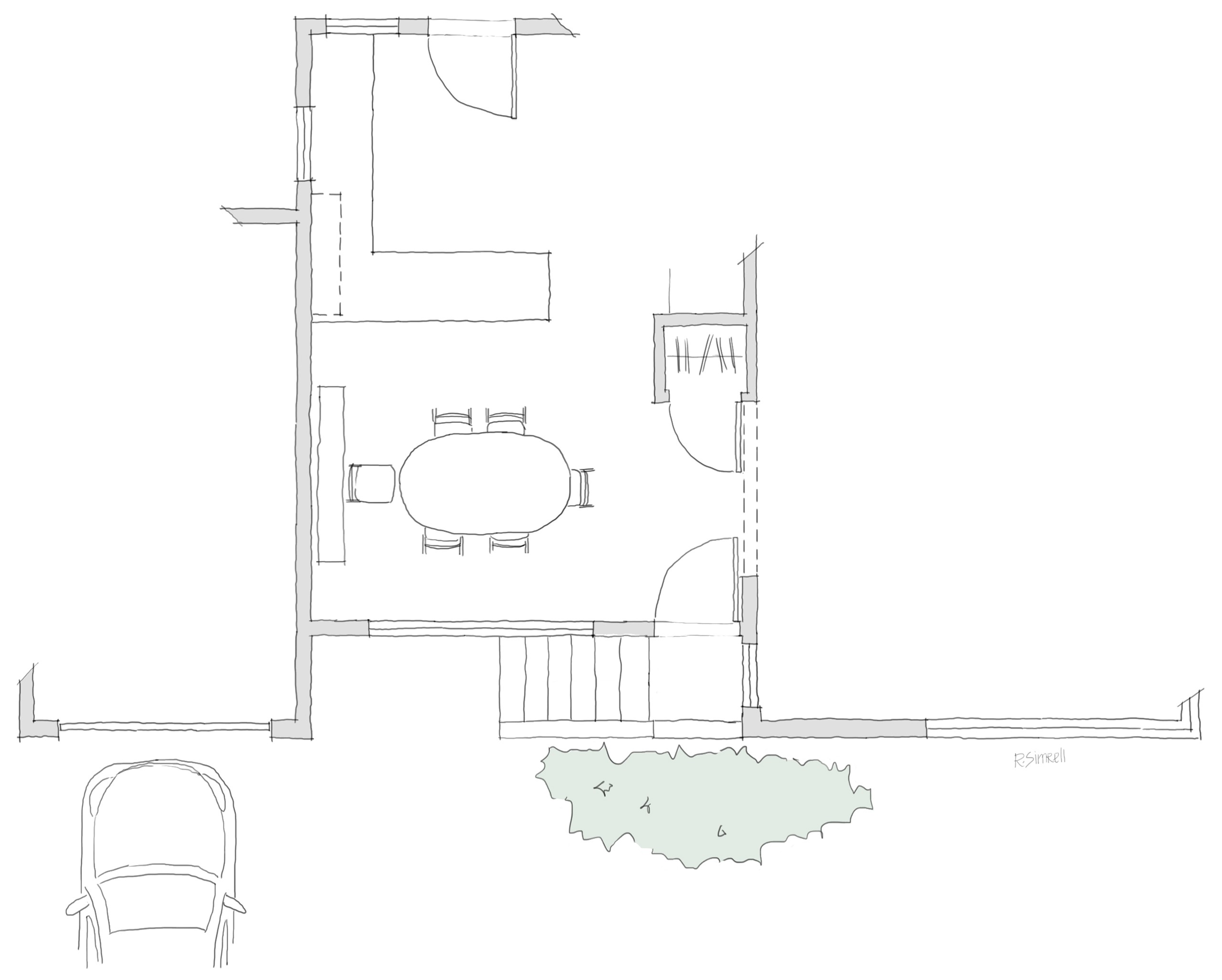
Floor Plan: Existing Conditions
The existing house featured an exterior stairway leading to the front door, which opened directly into the dining room.
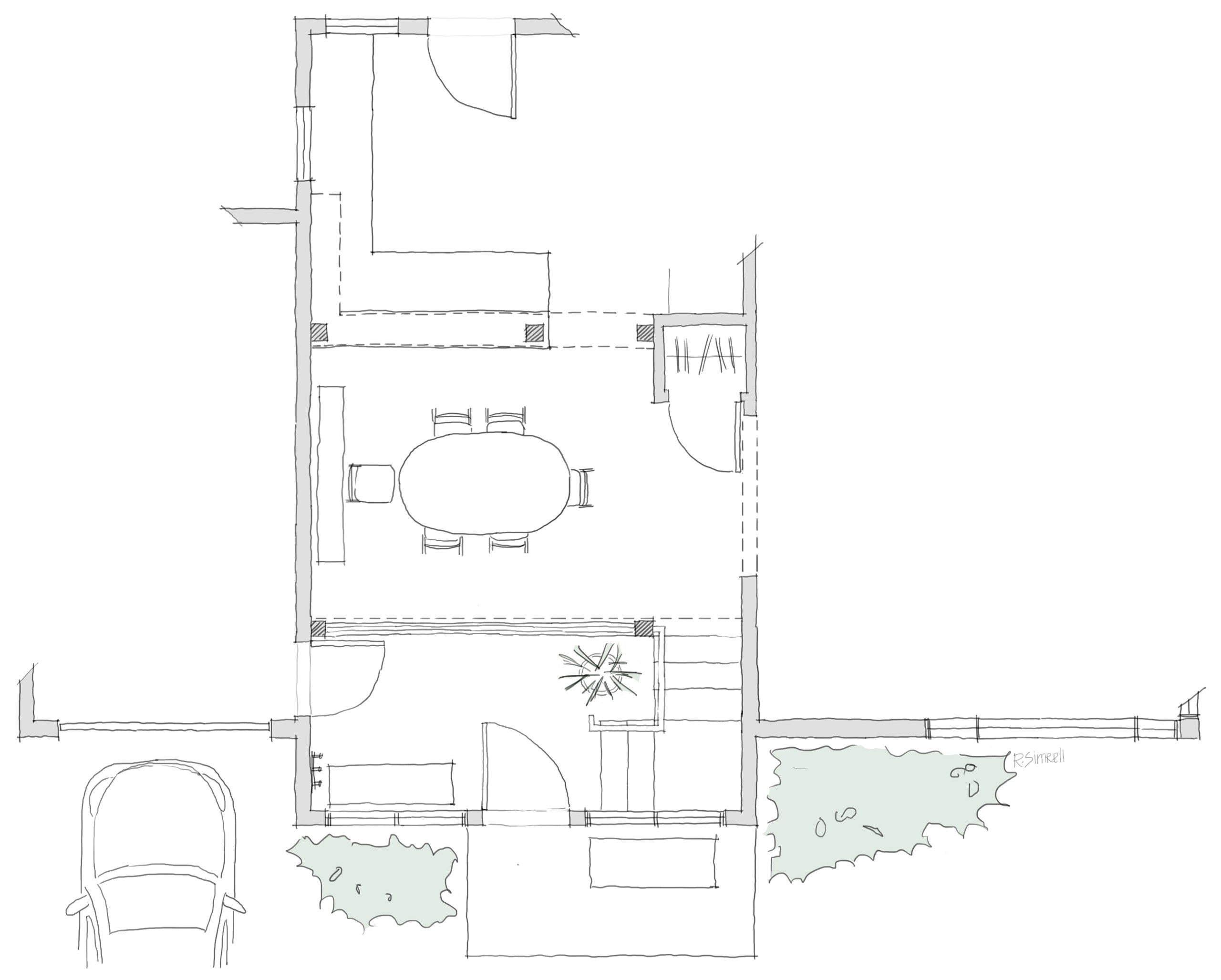
Floor Plan: Potential Entry Addition
A proposed solution is to build an addition that provides a little fanfare, creates a transitional space, and links the garage to the interior of the house.
So, see that? Yep, front door sans entryway: just dining room right away. Direct? Yes. Good design? No. Though, unfortunately, I didn’t sketch it, the existing roof overhang over the dining room window is a generous (a.k.a. deeply shading) four feet deep, which makes for a dimly lit space. Yet, fear not, a new entry addition, even minimal, grants an opportunity for a wall of windows to let the light in, a way to access to the garage internally, and a transitional space, to boot. It was starting to look like maybe a remodel might just work out.
Exterior Perspectives
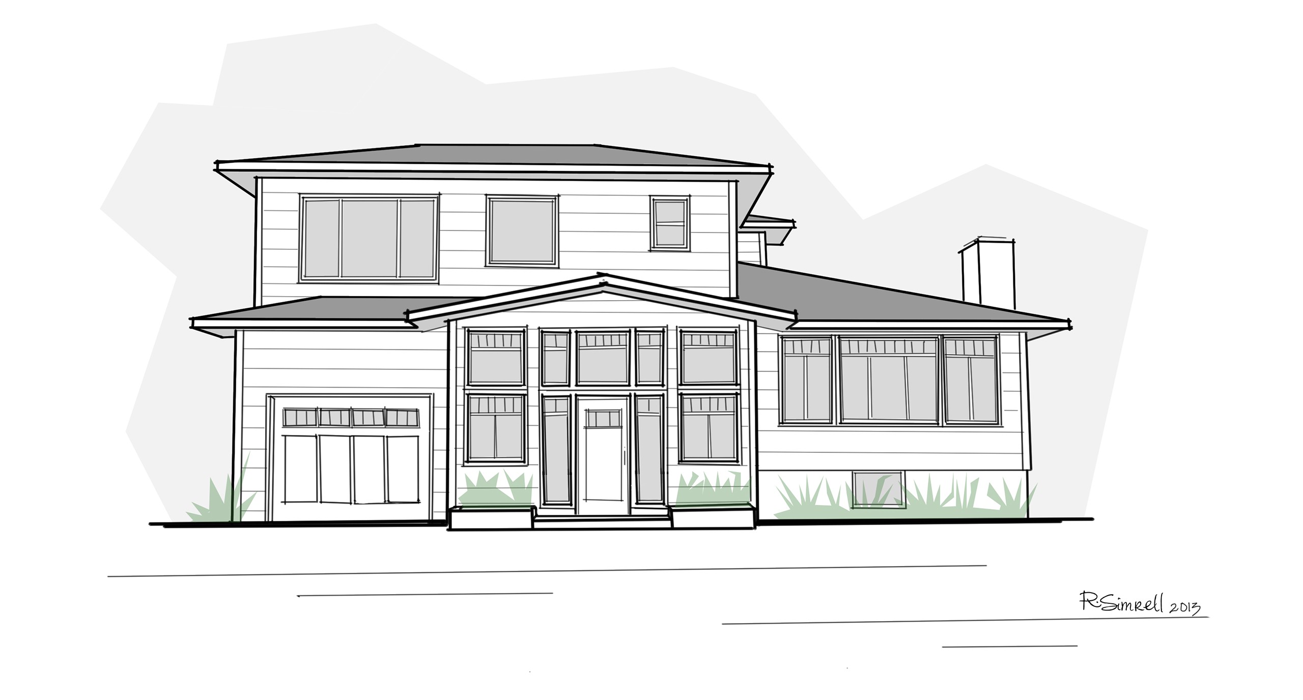
So, what would that look like? No client is going to commit to a big project without a good image in their mind of how it might turn out. So, I used a photo of the existing house as an underlay, and sketched up this first shot to demonstrate how the house might look with a new entry addition.
Possible Entry Addition
A small addition at the entry not only gives the façade the focal point it was missing, drawing attention away from the garage, but also resolves internal issues.
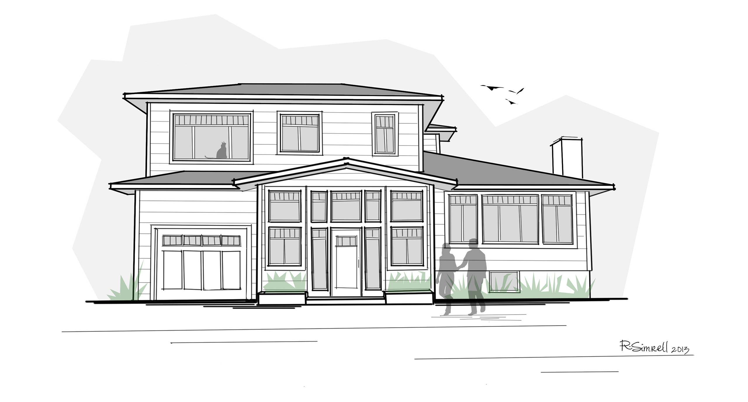
Possible Entry Addition & Trim Upgrade
By adding trim details to the façade – including corner trim, larger fascia boards, and window trim – the house starts to feel more coordinated.
At this point, the homeowners were very intrigued, and so we started exploring other little interventions that could improve the look of the house. Thus, the window, fascia, and corner trim added in the second image, which begin to tie the house together.
A Sectional Perspective
A big concern for the homeowners has always been the lack of privacy from the front door, but they weren’t entirely sure about how the proposed addition could ease this. Hence, this quick sketch, which illustrates how – since someone at the front door is not only further away in the horizontal plane, but also in the vertical plane – the field of view into the house is much more limited.
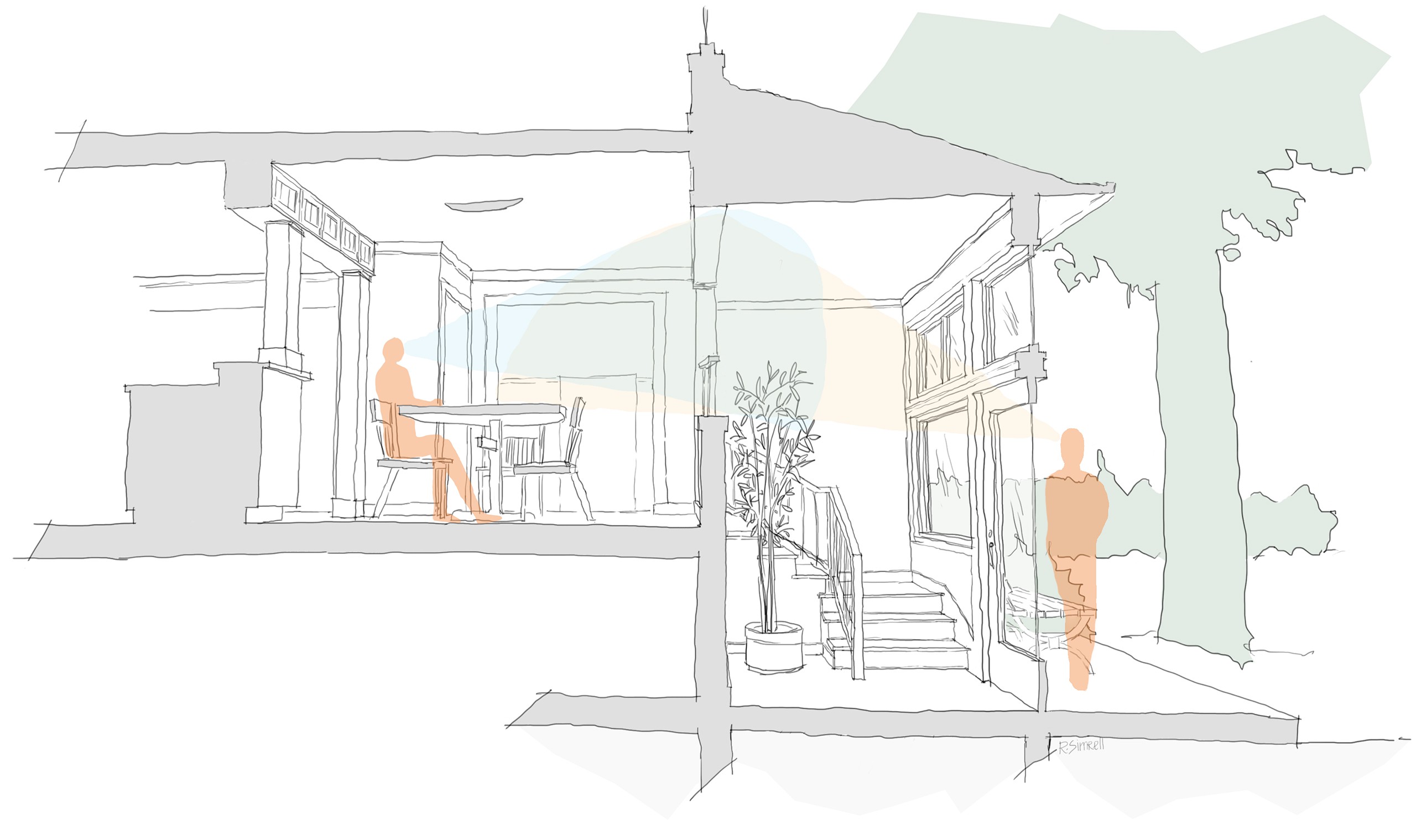
Sectional Perspective: View Overlays
In the existing house without the addition, someone at the front door looks directly into the space, as he or she is literally only one step out of it. This diagram shows how a proposed addition to the entryway creates privacy between the dining room and the entry through increased horizontal and vertical distance from the front door, limiting the view into the space.
Just this limited field of view and additional distance from front stoop to the main rooms of the house creates a privacy buffer, even with a wall full of windows.
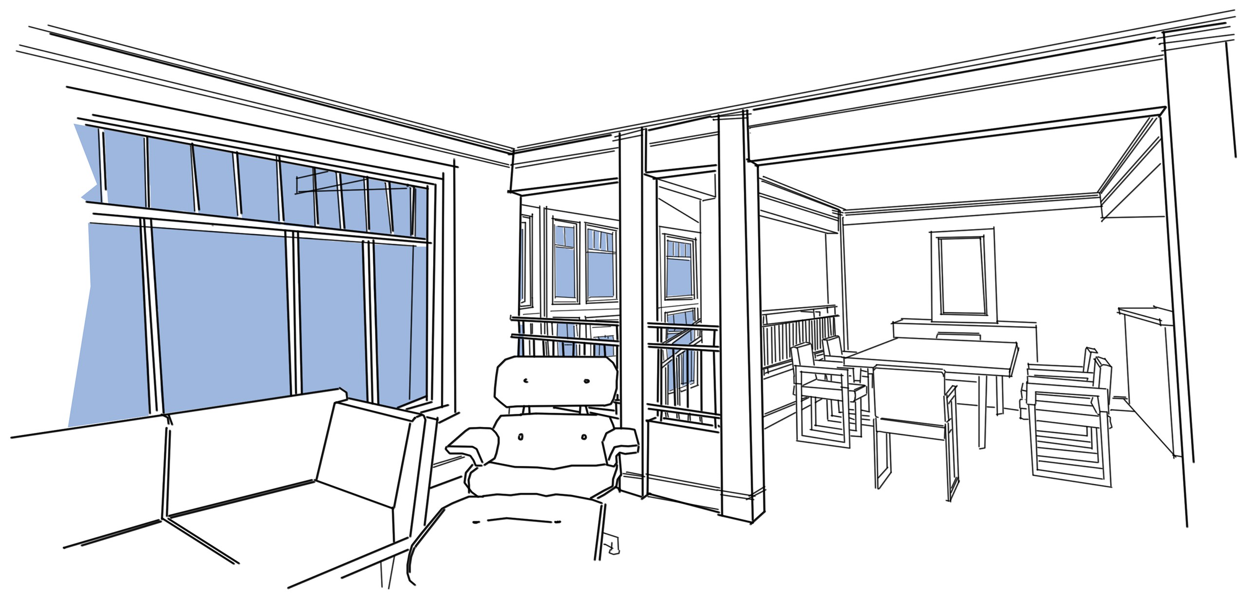
Interior Perspectives
Let’s take a peek at the scenario as experienced from the dining room table. When an entry foyer is added at ground level, someone at the front door feels much further away than someone standing at the edge of the dining room, in the location of current front door. And, beyond the privacy issue, you can see that even with the exterior wall further away from the table, the large windows invite in more light, and frame a more expansive view.
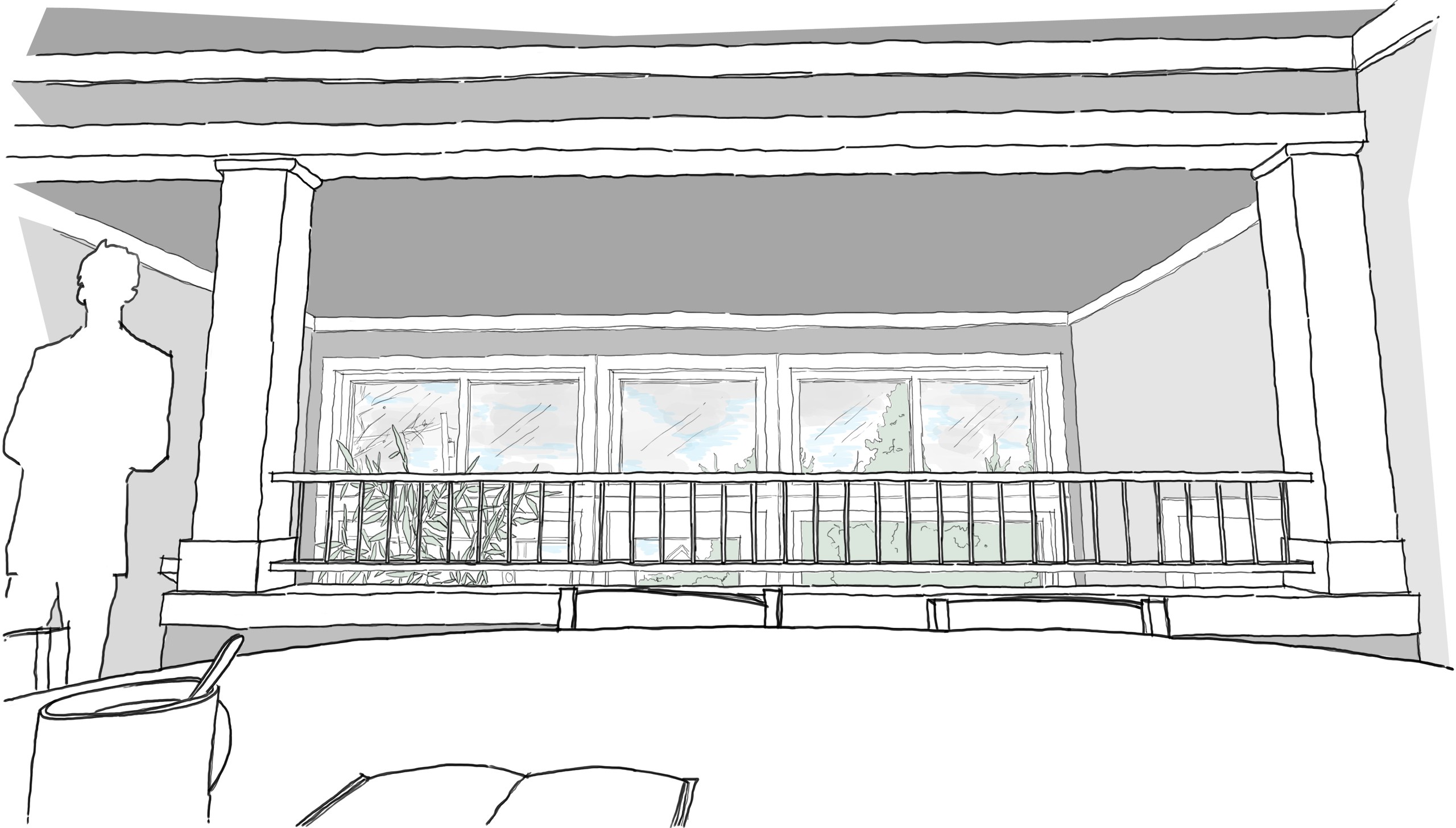
View to the Entry from the Dining Room Table
In the existing house, the front door is where the figure stands in this sketch. With the proposed new entry addition, the front door moves down to ground level, and the exterior wall is further away from the dining room table. But, even so, thanks to more glazing, the view is more expansive, and much more light enters the room.
Stepping now into the shoes of someone standing at the top of the stairs, we see a modestly updated kitchen. This intervention would not be a full overhaul, just some new finishes and some space-shaping cabinetry to help define the kitchen and dining room. No appliances, plumbing, electrical, or mechanical elements would be moved in this scenario.
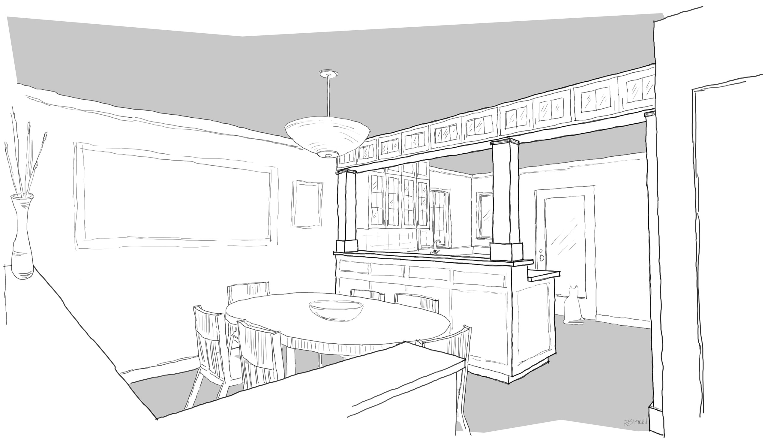
Shaping Space with Casework
With the wall at the north end of the dining room open to the new addition, this is the view into the dining room and kitchen, after ascending the entryway stairs. Cabinetry and wood-trimmed posts define the open spaces and introduce a richness of detail that is missing in the existing house.
These are only small alterations suggested in this early phase: just a potential way to resolve the complaints about the house, and to update the kitchen finishes. By this point, the homeowners had explored the housing market for a place to start fresh, but nothing they found was quite right either. So, with the reassurance that a remodel would meet their needs, they decided to jump in. The project was on!
So, It’s On. Now What?
With the project official, the real work began. The first order of business was drafting up “as-built” drawings: a set of architectural plans documenting the existing house. With those complete, I set about exploring and refining the proposed design.
Closed vs. Open Plan
Not least because one of the complaints about the house was that the north-facing main rooms felt dark, it was our recommendation that we open up the plan as much as possible in these rooms, to maximize and share light between the spaces. But there was debate between the homeowners: would an open plan not feel sheltered enough? How do you decide if not on principle? In come the sketches! And by this time, you’ll notice, I'd found my new sketching technique: fast, graphic lines, but slightly askew to keep it a little rough. These three pairs of images allowed the homeowners to flip back and forth on each view, toggling between the option of opening up the walls, or leaving them closed.
View from Kitchen: Wall Closed
With the wall between the new entry and the living room closed, the view from the kitchen to the living room windows is greatly limited.

View from Kitchen: Wall Open
When the wall is opened, the entire spread of living room windows can be experienced from the kitchen.
View from Entry: Wall Closed
When seen from the new entryway, the entry feels very segmented from the living room.
View from Entry: Wall Open
Yet, with the wall open, a peek into the larger space enriches the whole experience.

View from Living Room: Wall Closed
Again, with the wall closed, the living room feels completely separated from the entry, without even a peek.
View from Living Room: Wall Open
But, with the walls opened, one can peek into the entryway, while still feeling physically separated.
With these visual aids, the homeowners came to agree that the benefits of an open plan far outweighed the downsides, and we moved forward in the design process.
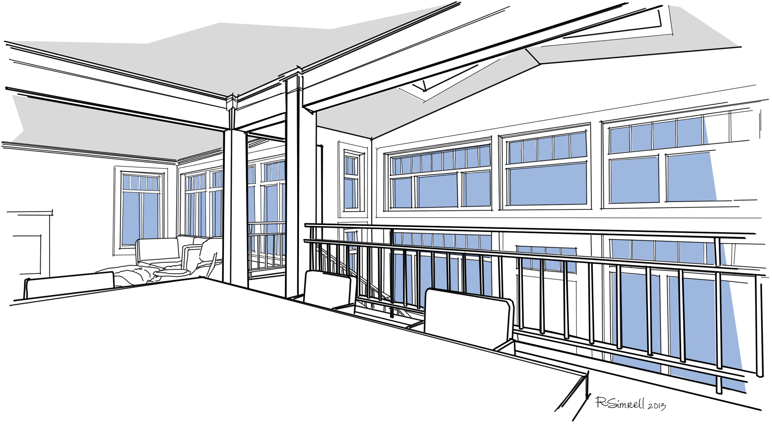
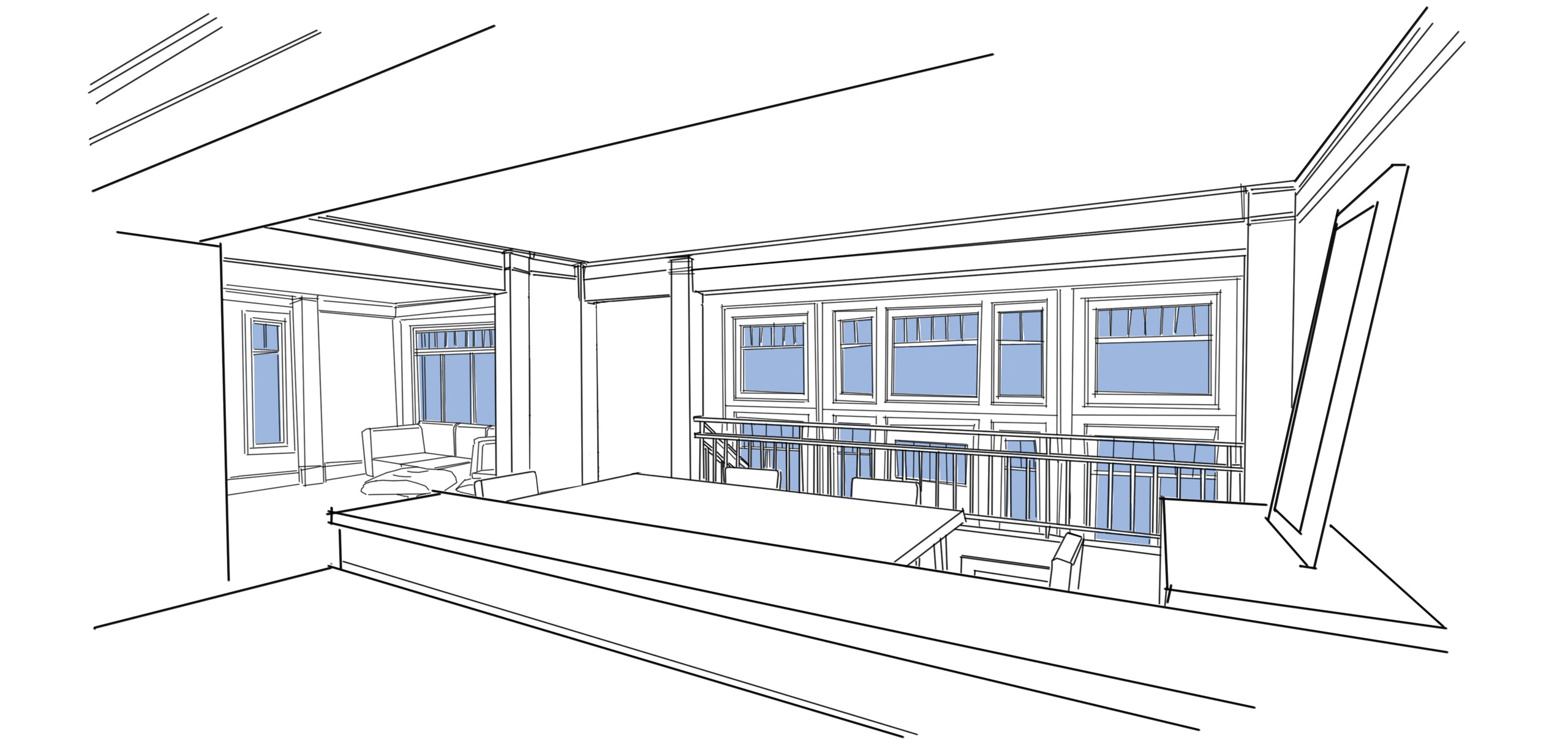
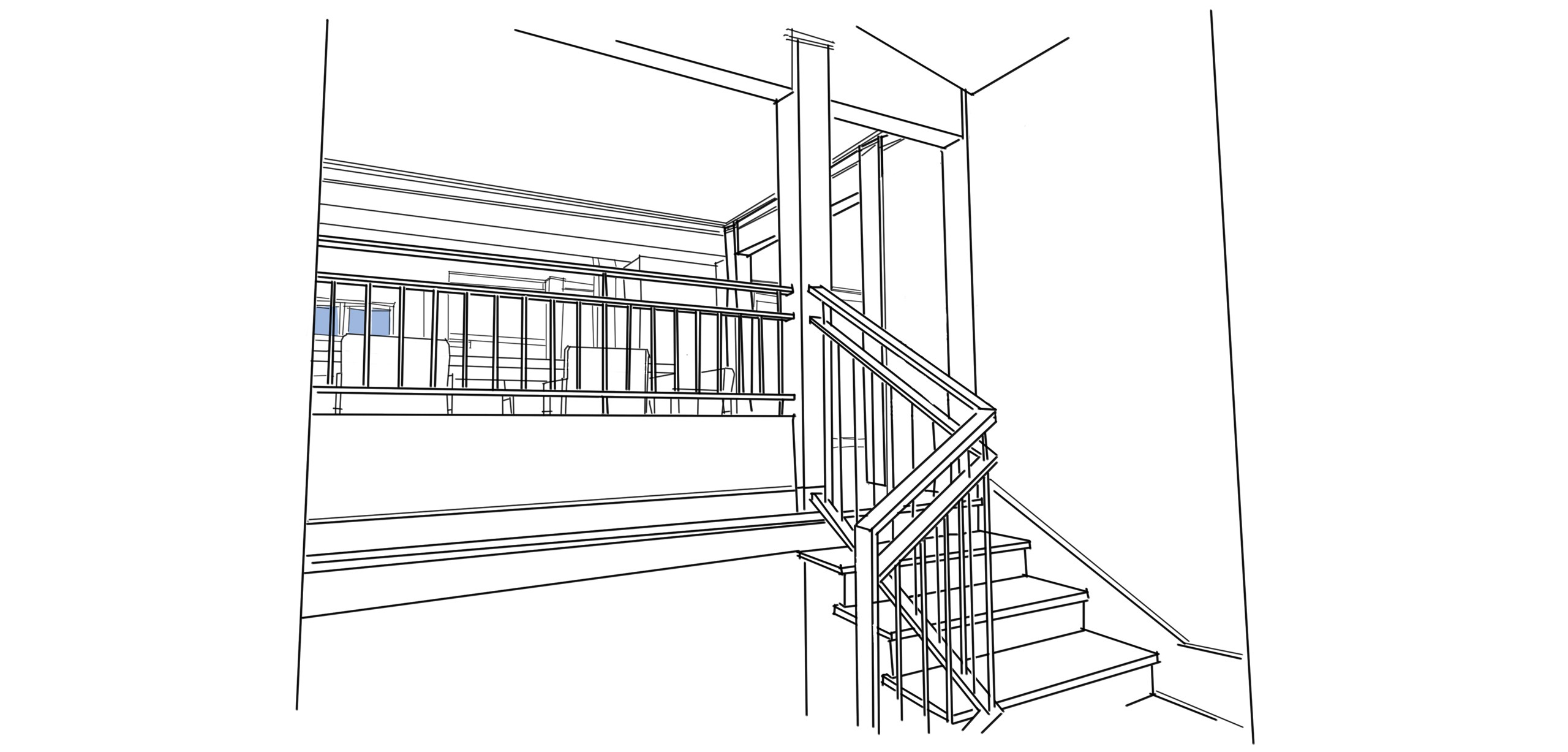
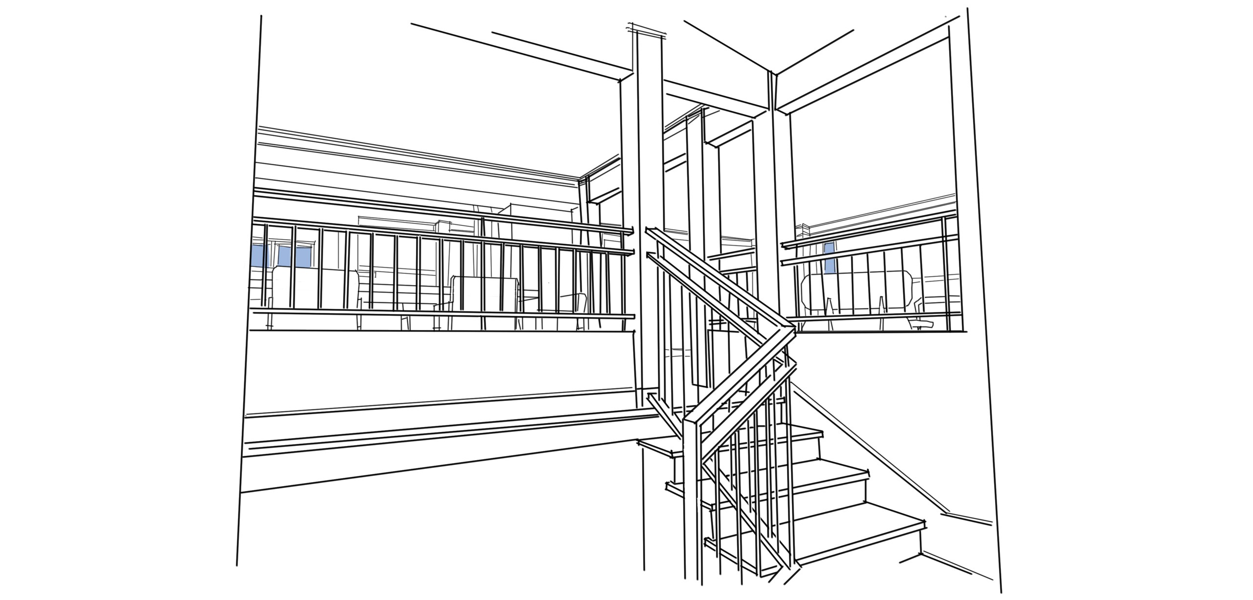
An Open Plan with the Windows Galore
With a wall of glass and skylights in the new entry addition, and with the interior walls opened up, the formerly segregated spaces will feel open, inviting, and full of light and life – perfect for filling with friends and family for a dinner party.
As the design evolved, we opened up the plan even more, eliminating the additional post and extended railing between the living room and dining room. There would be skylights in the new addition, divided lights in the windows, a brushed steel railing, and plenty of trim details, even crown molding.
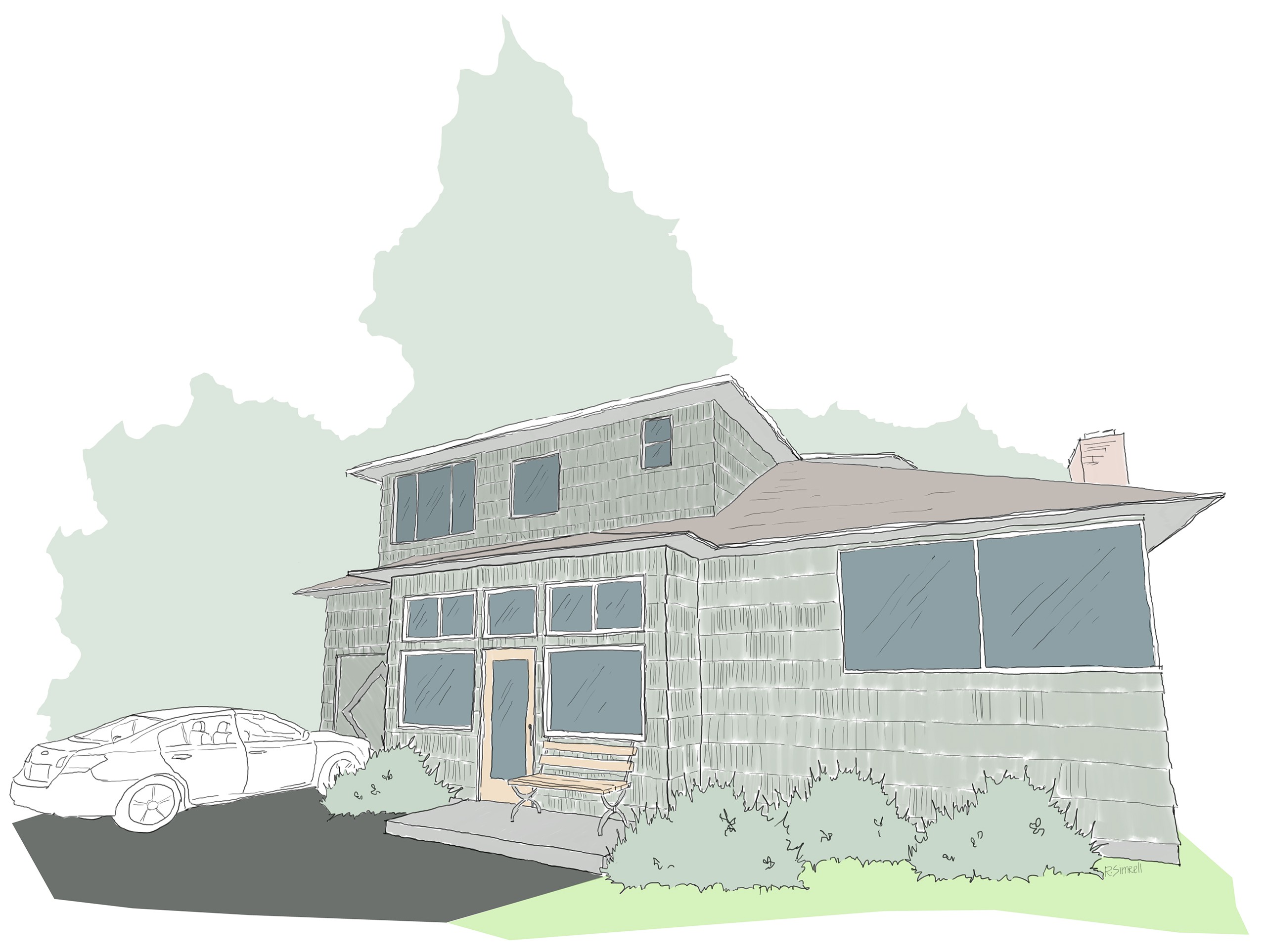
Exploring a Façade “Facial”
The existing house makes little effort in terms of “Street Presence.” In fact, it looks a bit better in the sketch below than in real life, as I made an improper assumption when I sketched it that the windows aligned with one another. My bad. (Update: You can take a gander at some “Before” photos here.) Large bushes hide some of the awkward siding details, but they also obscure the approach to the entry. The garage is the most prominent feature, especially with its eye-catching diamond detail.
who doesn’t love some pretty pictures?
But, before committing to expand the scope of the project, the homeowners needed some visuals. And, who doesn’t love some pretty pictures? So, through a series of façade sketches, we explored how we could update and unify the look of the whole house, merely with some superficial upgrades: new windows (some in adjusted openings), and a concrete planter to augment the addition.
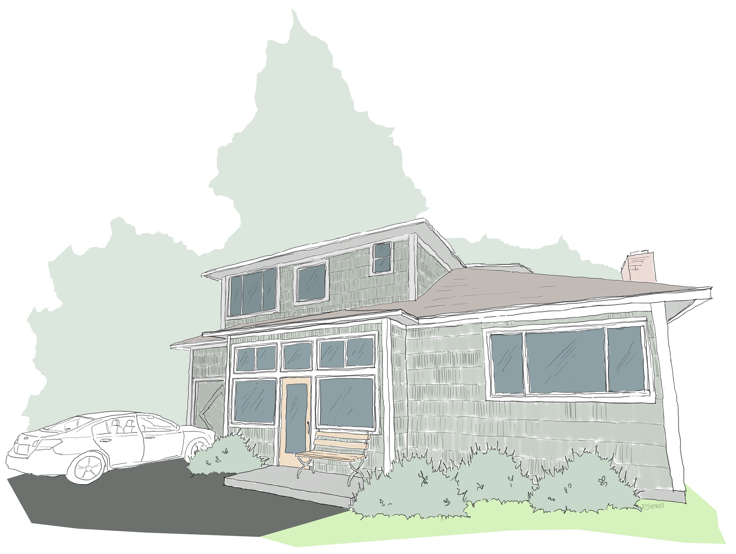
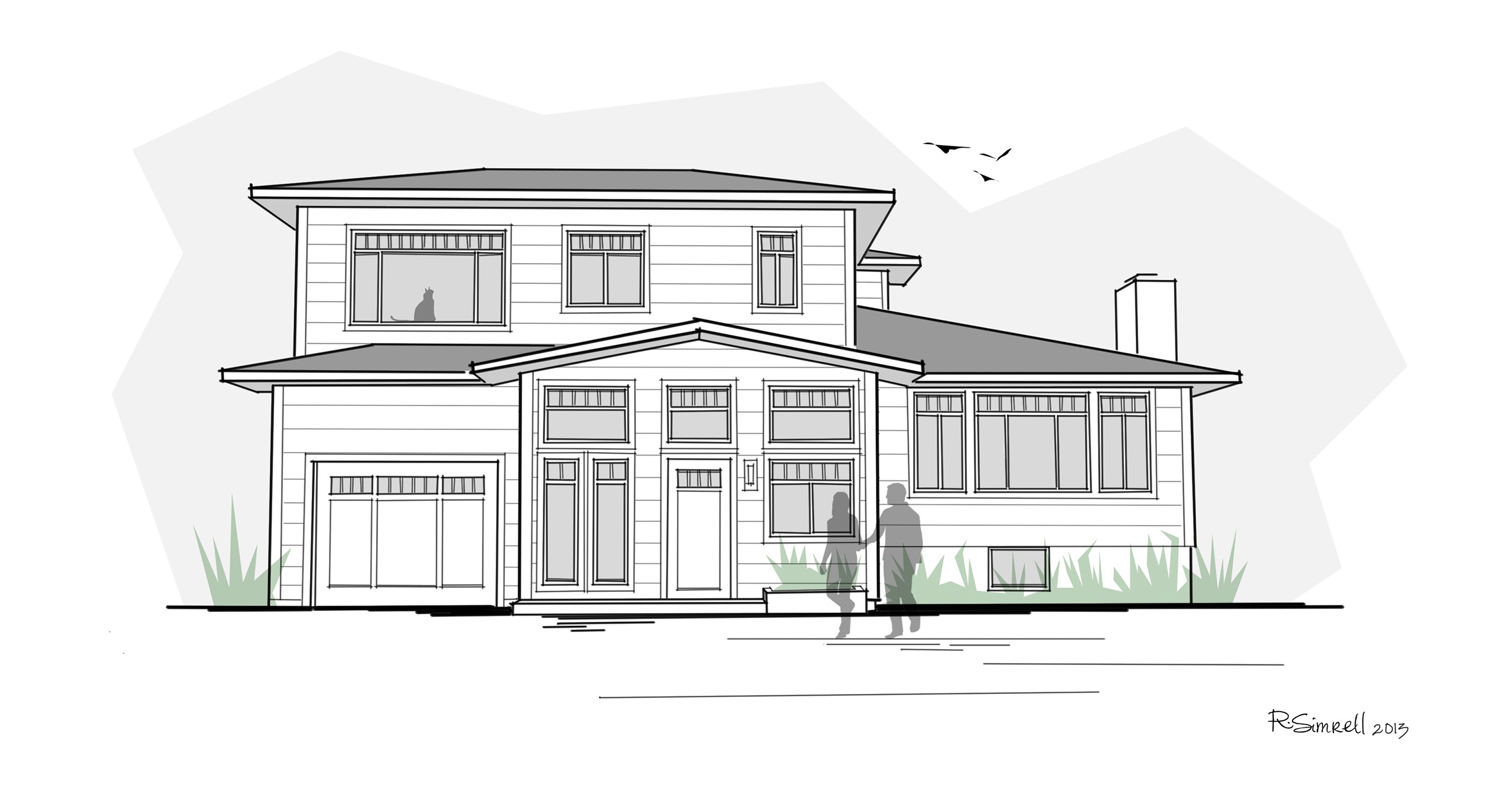
From “Existing Conditions” Through Early Iterations
Moving from the sketch of the existing house to the first proposed iteration, as soon as we add the new addition, the front entry becomes the most prominent feature, not the garage. Suddenly, the house starts to feel like it has some street presence, though it doesn’t begin to feel unified until all the windows are upgraded.

Existing Conditions
The existing house is very basic, to the degree that it fails to provide some of the simplest features of home: access to natural light and personal privacy.
New Addition, First Floor Update
The first façade iteration features a symmetrical entryway, and updated windows on the first floor only.
New Windows for the Whole Façade
When new windows are provided on the second level, as well, the house feels more unified.
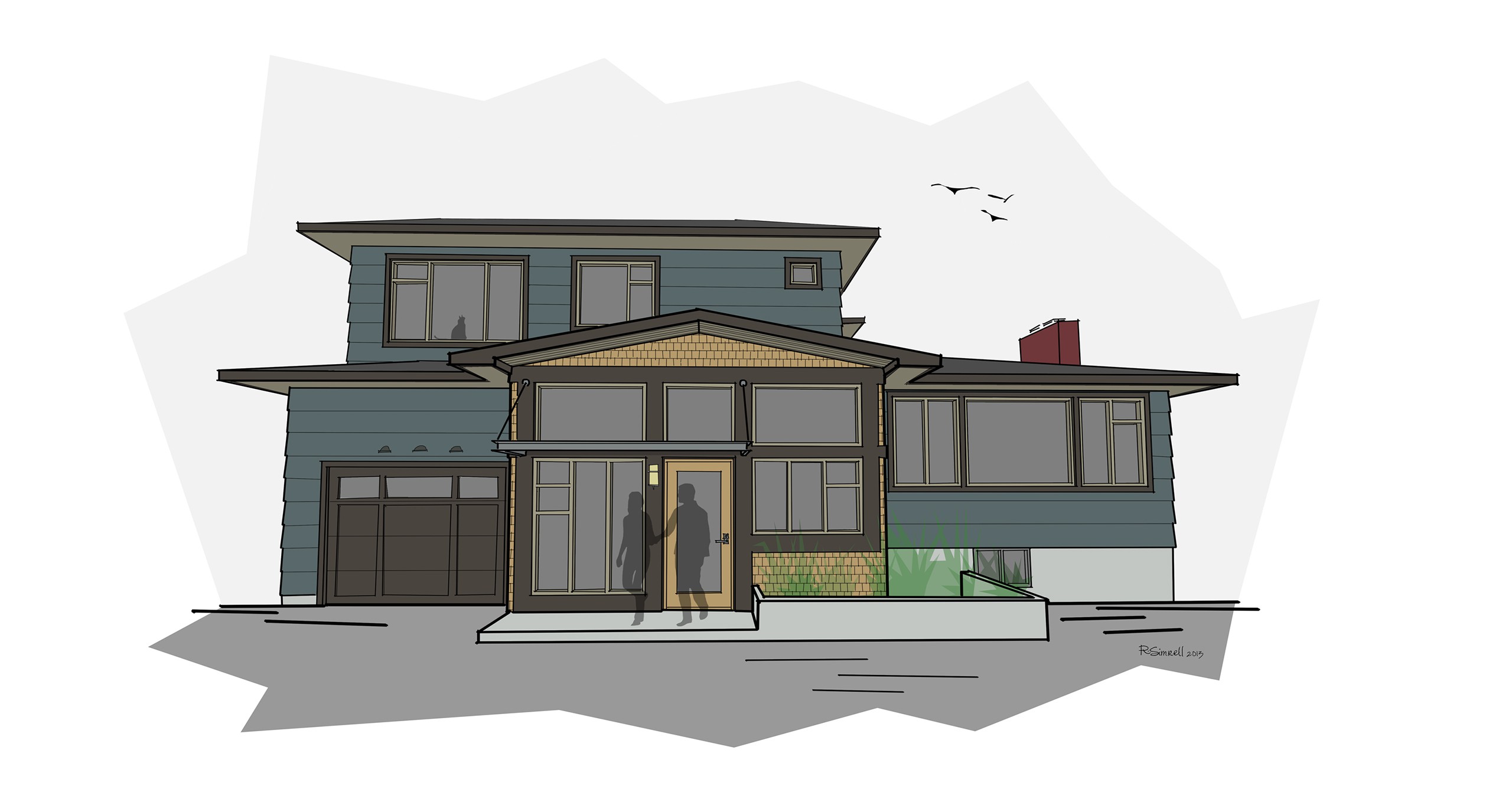
Creating Asymmetry
Stepping away from the very symmetric entry layout, the windows at the entry stairs have lifted sills, and the concrete planter only appears on one side.
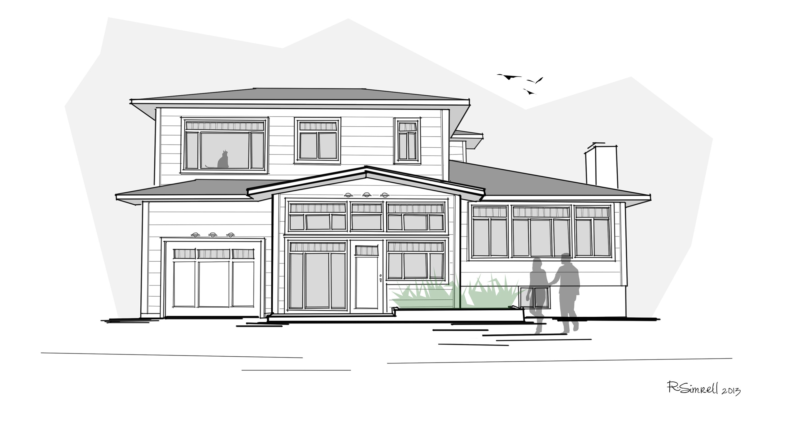
Creating Balance
To better balance the larger windows to the east of the front door, and the second story above, the concrete planter extends asymmetrically to the west.
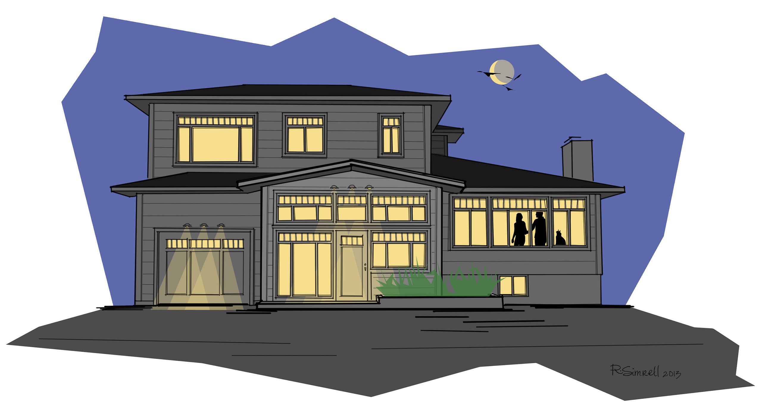
Night View
Just for fun, this is the same design iteration, but sketched as if it were dark out.
Through the iterations, by the end of the Schematic Design phase, the remodel plan featured not only the addition, but also all new windows, and an asymmetric concrete planter. Now, the homeowners were excited about how little a change could make such a large visual impact, and, pending some budget assessment, wanted to expand the scope of the project.
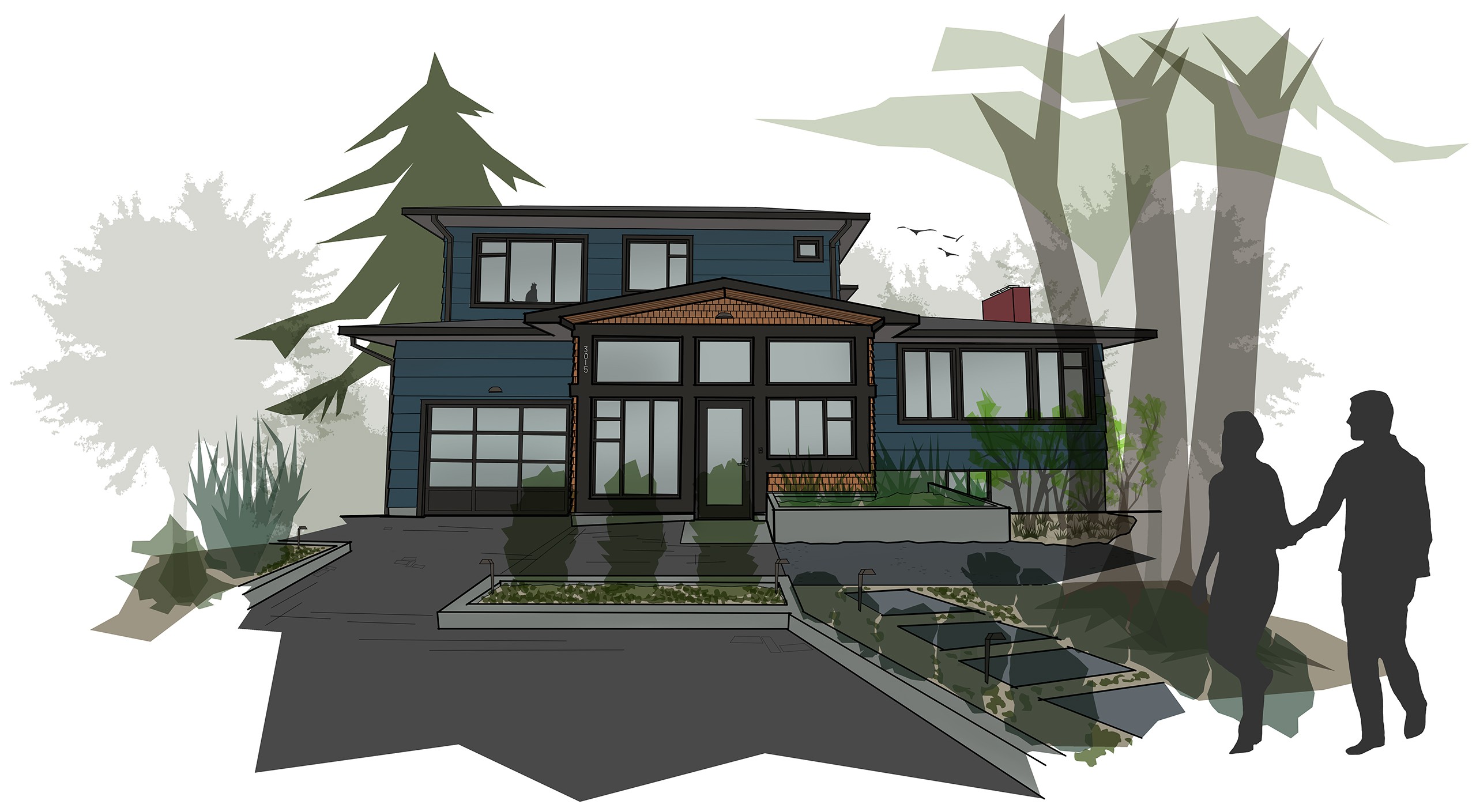
A Shift in Style
With a full remodel green-lit, the façade design moved right along with the evolving project. As the homeowners explored their architectural tastes, they realized that they preferred a more contemporary – or transitional – style. So, we dropped the divided lights from the windows and the crown molding from the interior, and set about designing the home to bridge the gap between its basic form and the more integrated, contemporary Pacific Northwest style we were seeking.
A Contemporary Shift
Once the whole house was game for a remodel, the style shifted contemporary, with a clean, custom, asymmetric mullion layout for the windows, accent siding on the new addition, and modern a steel & glass suspended awning.
And, here we leave it, for now. The permit set of drawings is in the works, the contractor has scheduled out the months of construction ahead – all of the ducks are nearly in a row, as you might say. And, the sketches have been a success. In fact, the one of homeowners requested a photo-quality print of the latest version, which she pulls out of her purse to show her friends when they ask her how it will all turn out. Pending permit acquisition, construction will begin this fall. So, stay tuned: eventually, rather than sketches, we’ll have some real photos to share with you!
Update
May 18th, 2014
Contruction through the winter and early spring has gone well, and we are approaching the finish line this summer! We’ve decided to invite a Landscape Architect to the project, Chris White, to help us refine the landscaping and hardscaping in the front of the house.
Final Design with Landscaping
From the new frosted glass garage door, to the additional concrete planters and curbs, replete with carefully designed landscaping, the house will soon have the street presence it deserves.
Now, instead of just the one concrete planter at the entry, there is another, smaller, one to cap the permeable paver drive, and curbs to edge the landscaped beds. A pedestrian path will approach the new entry addition at an angle between the new drive and the existing large cedar trees. Can’t wait to see it!
Update
August 17th, 2015
Here’s a fun little comparison. It’s not “Before & After,” but rather, “Rendered & Real.” The rendering is a hybrid of a photo shot during construction with some Photoshopping that moves the clock forward to help visualize the finished project. We used it to try out different exterior paint schemes back in June.
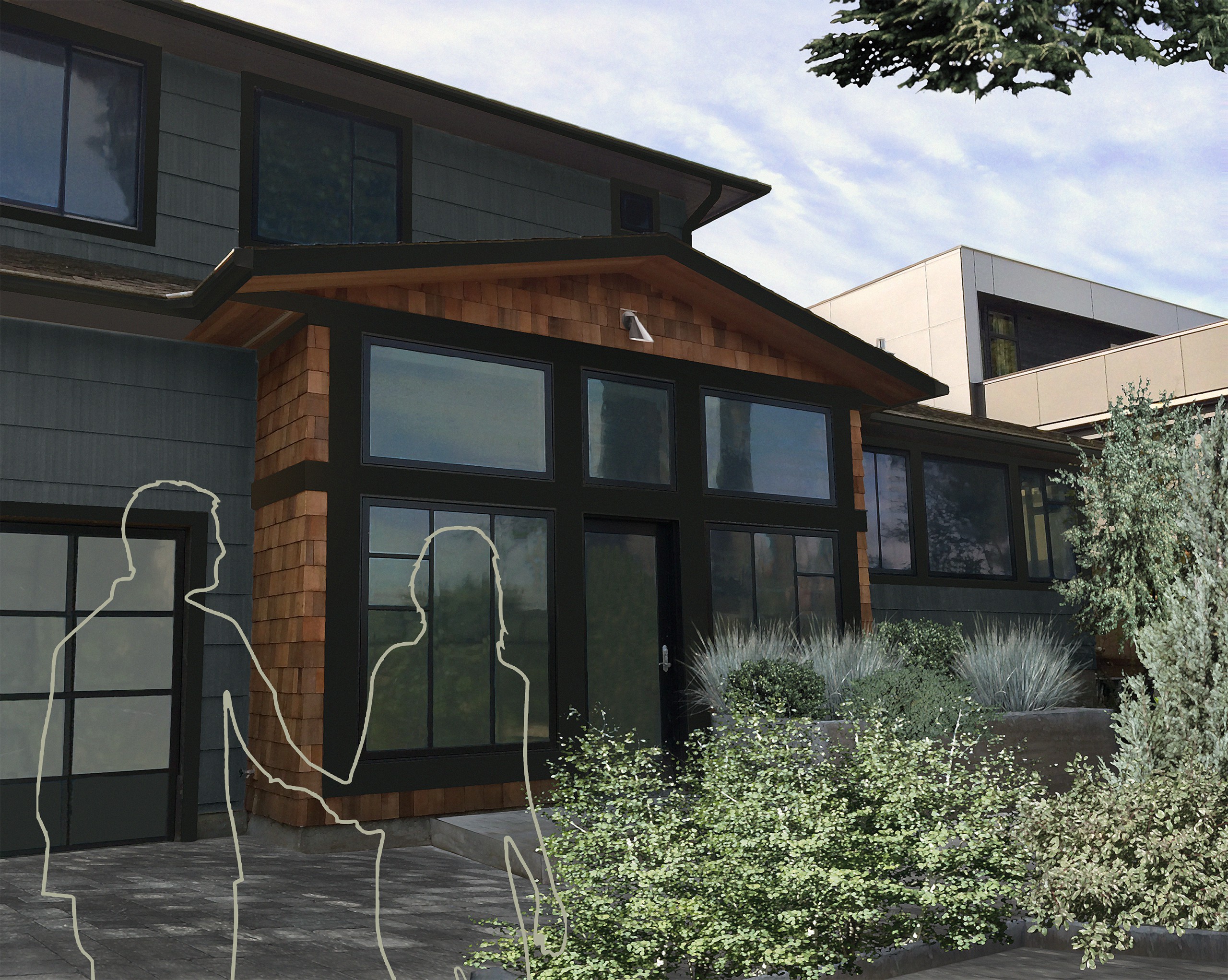
Rendered…
During the construction process, a rendering helped us to visualize potential exterior paint schemes.
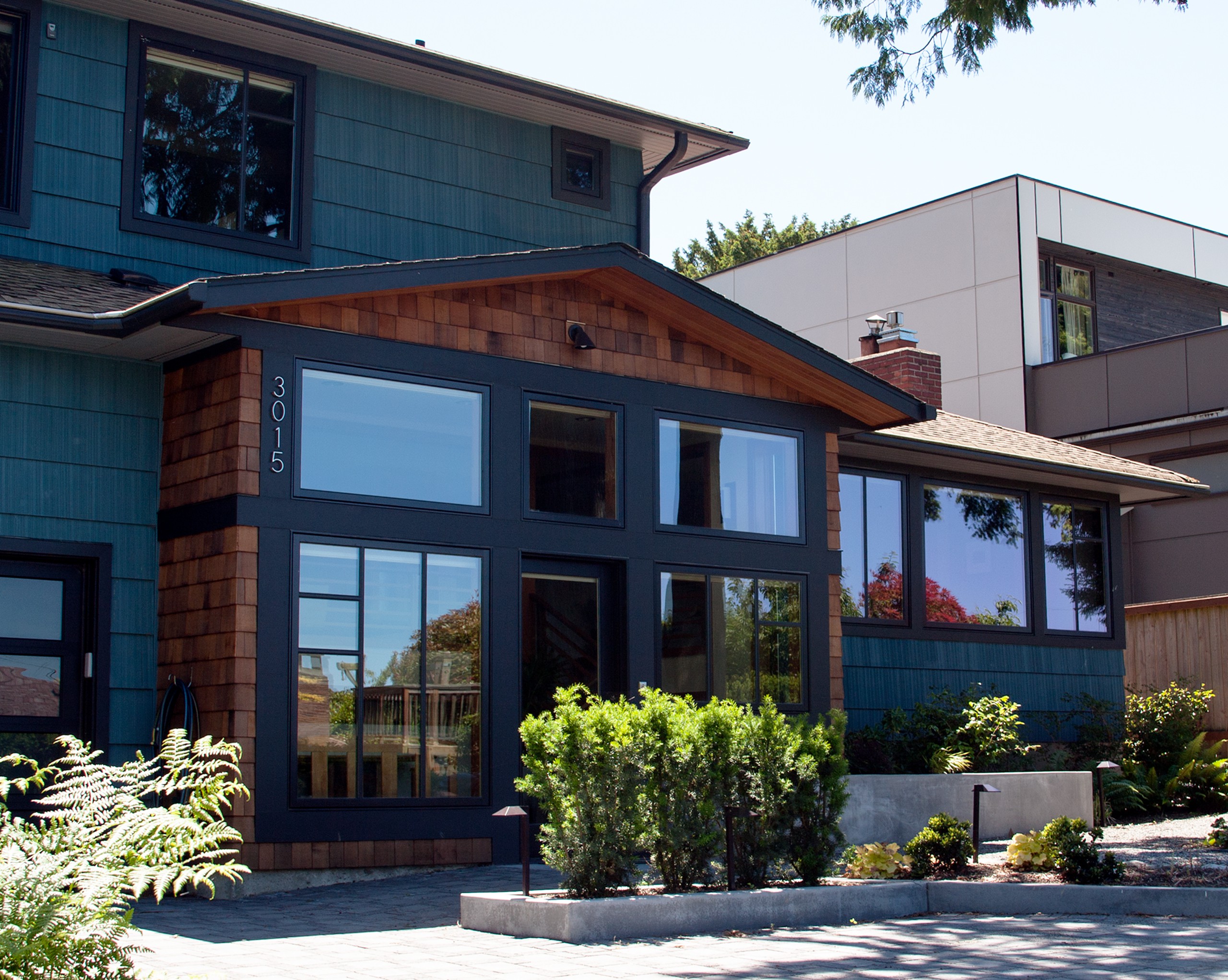
Real!
And, here it is: the finished product! A new entry addition, and a whole new look.
And the “Real” shot is from August. The house is complete, and the landscaping, though still young, is planted and beginning to fill in. So exciting: from cartoon sketch to real life, it’s been an amazing transition!
Good news! You can now explore the portfolio spreads for the 92nd Street Residential Remodel & Addition, and, for good measure, you can also have a look at the Before & After blog post.


